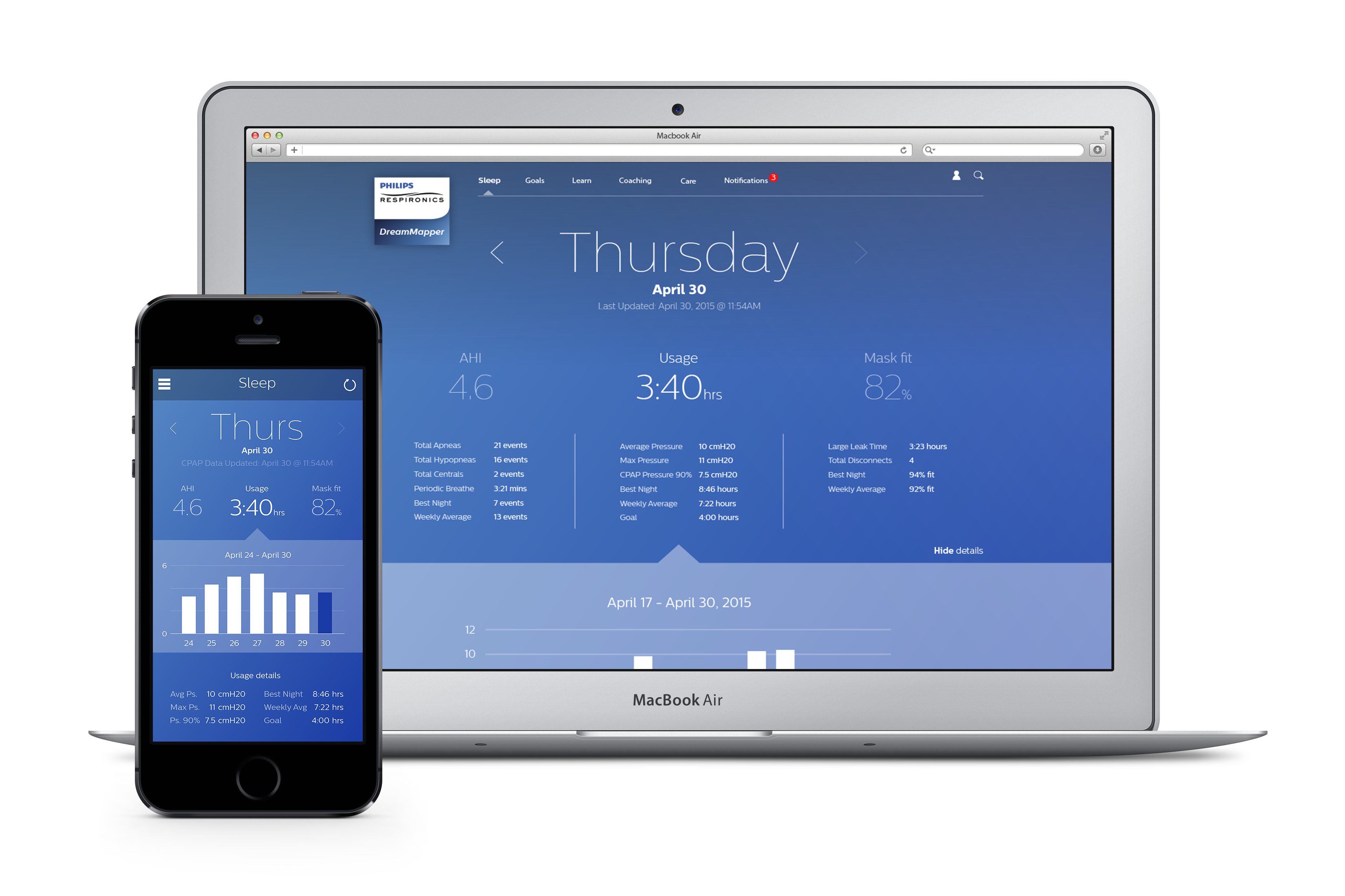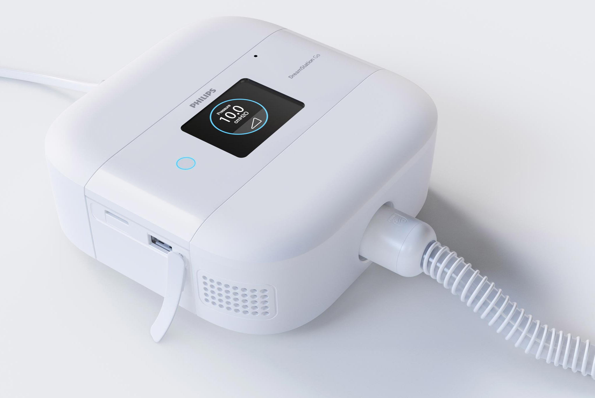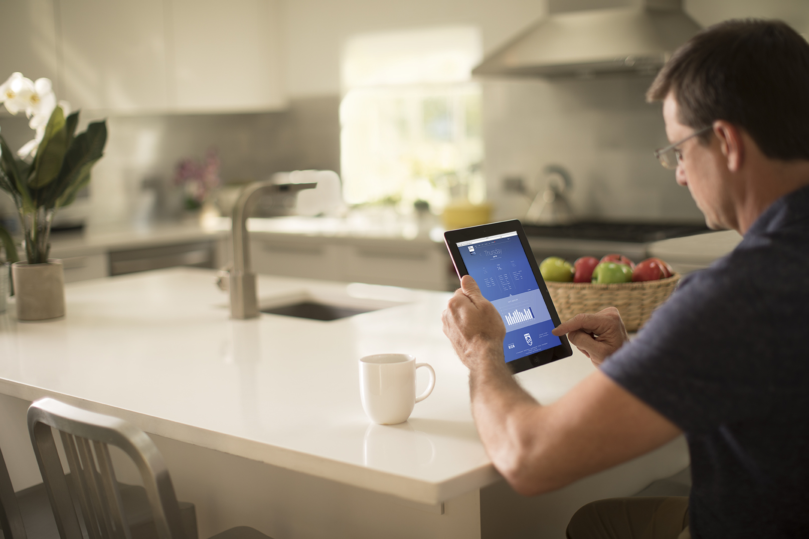
DreamMapper is the consumer focused digital experience built to help patients learn about their CPAP therapy in an effort to increase therapy compliance to ensure insurability. It affords the patient visibility into their sleep data and how they are progressing through their therapy experience while reducing anxieties new patients experience during their journey into treatment.
Initial Project Needs
DreamMapper is an experience that would overlap patient needs and professional coaching to create a holistic approach to helping patients become successful in treating their illness. Our existing application was not on brand and some of the workflows were very confusing. Design was asked to refresh the application to our new brand standards while exploring ways to ease patient use.
Understanding Our Users
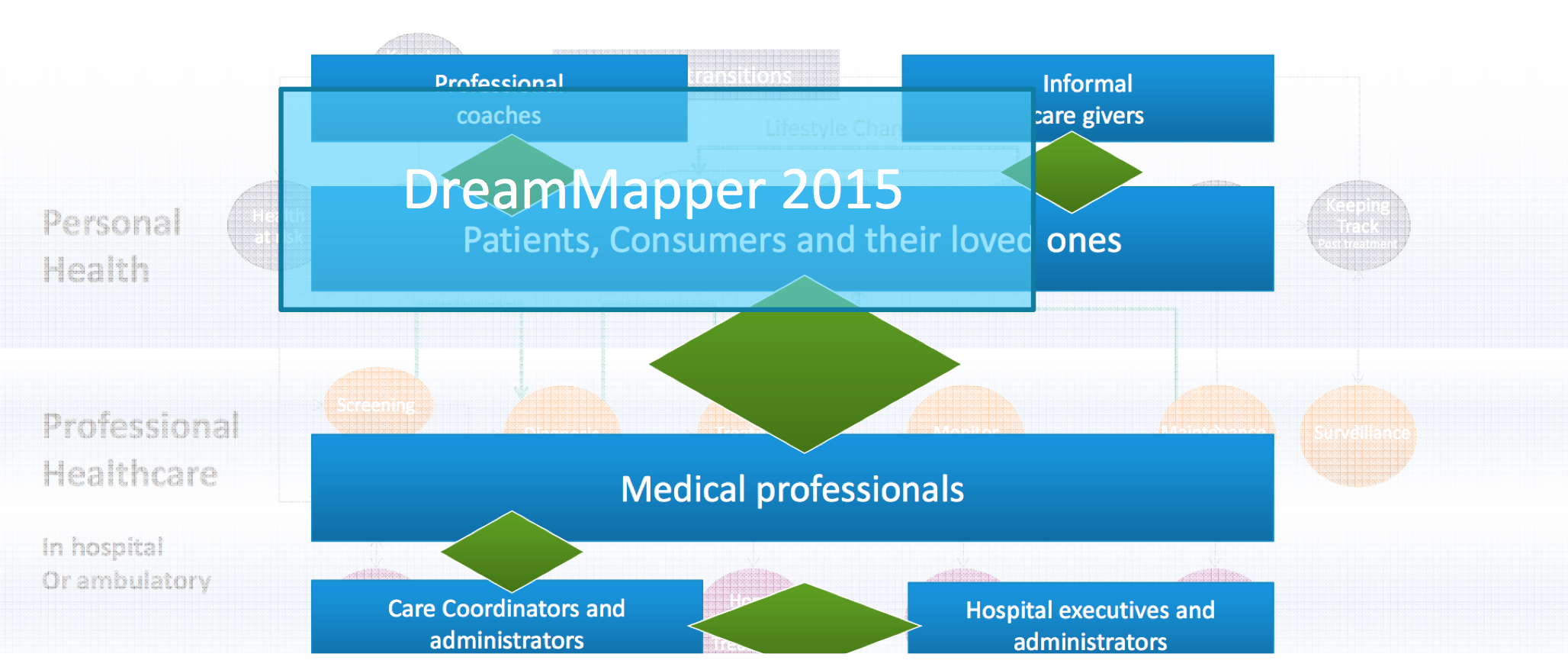
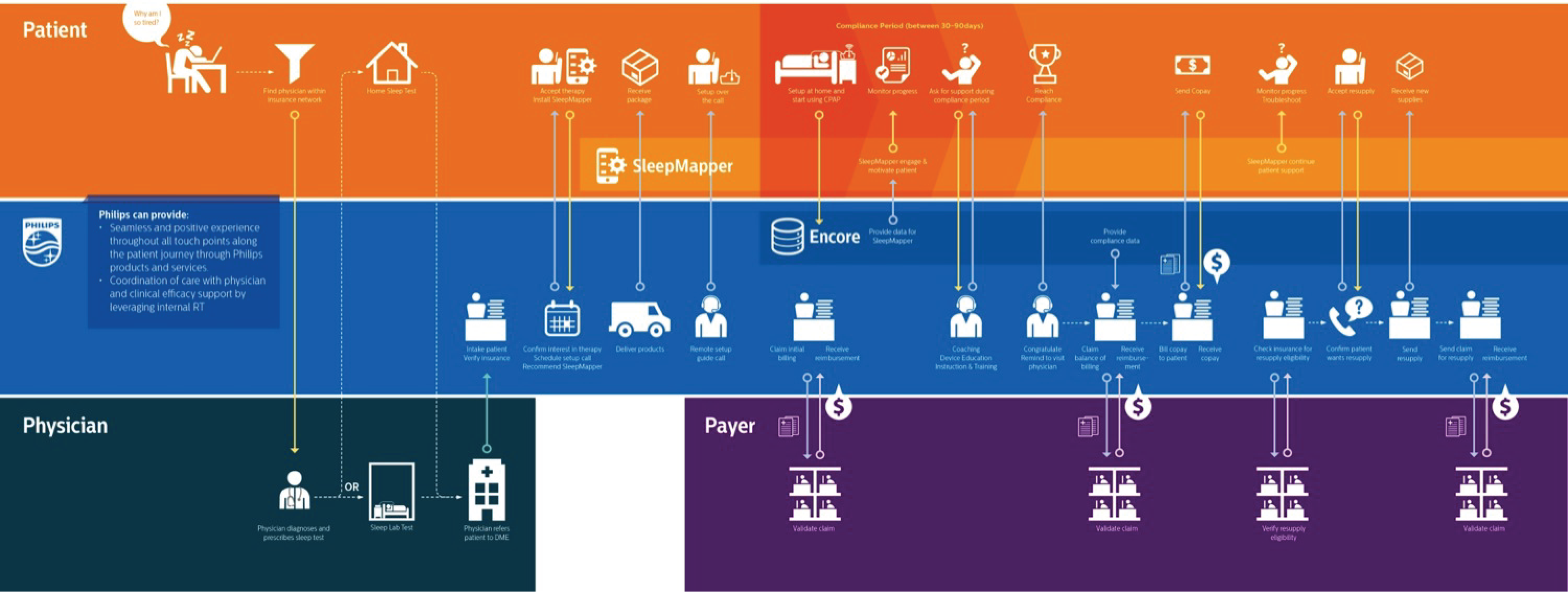
We used a patient journey map to align on our understanding of the process the patients go through when starting OSA therapy. This also allowed us to see where we may be able to create opportunity spaces to improce the app experience.
Reviewing The Current State
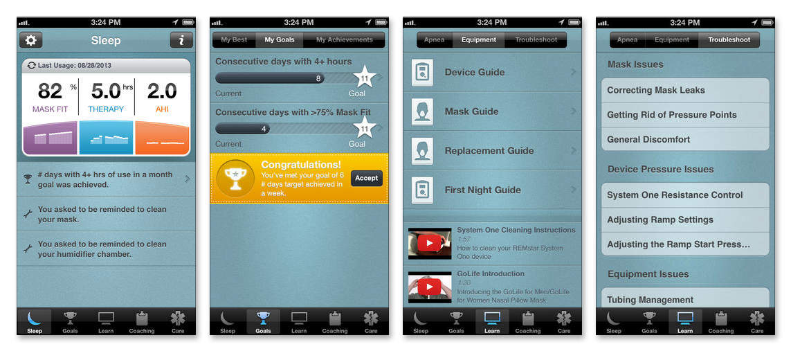
We did a review of the current application both on web and mobile. We broke down each section and explored all the different interactions that made up the experience.
Understanding The Competition
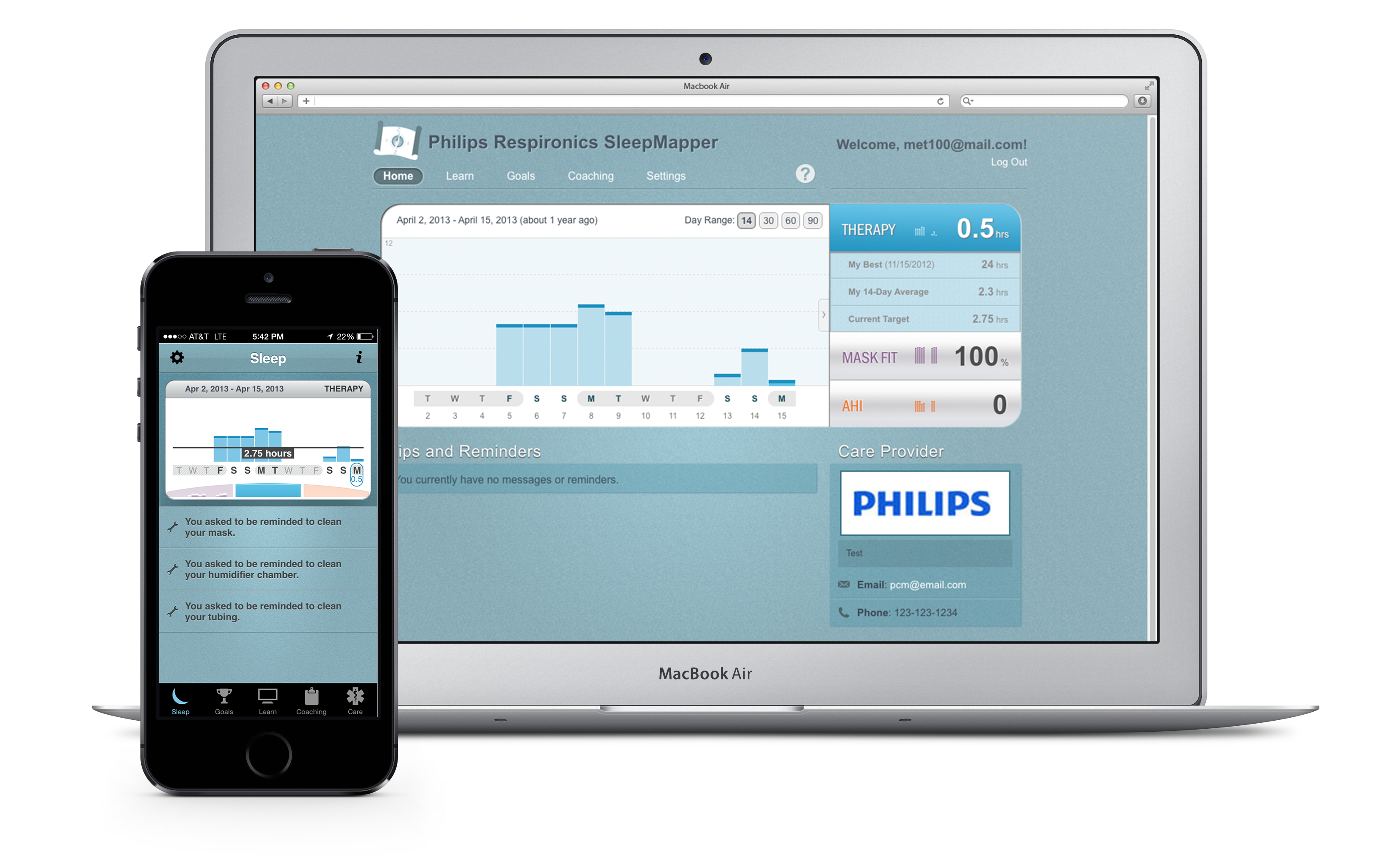
We then explored the application provided by our current leading competitor, Resmed. The myAir app was a very clean design that had some unique takes on how to understand patient sleep data.
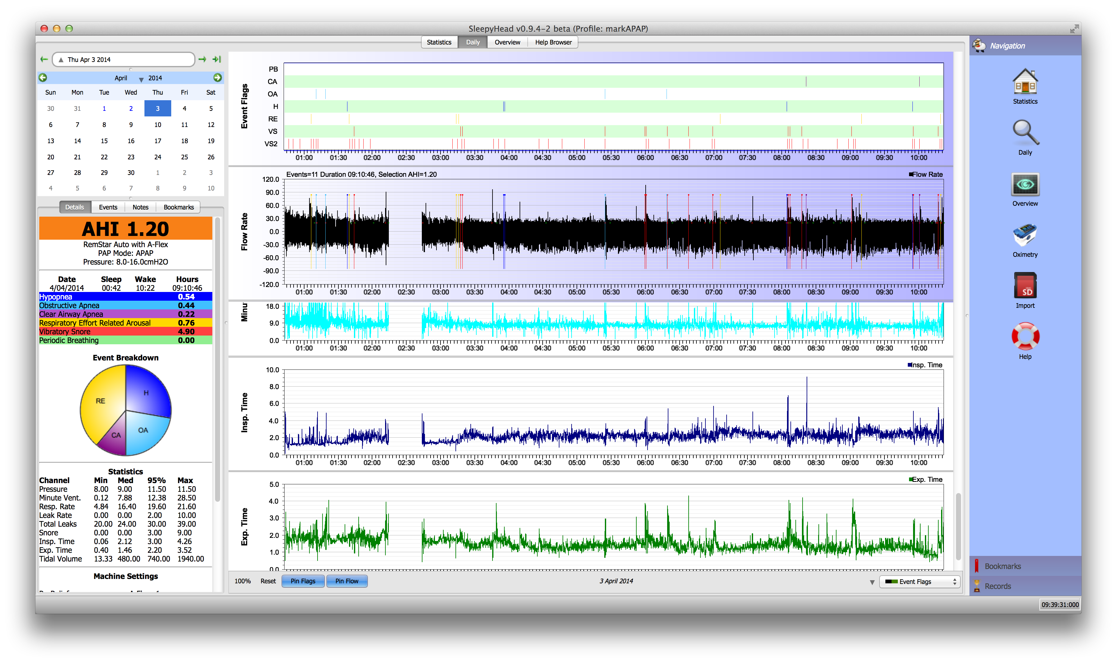
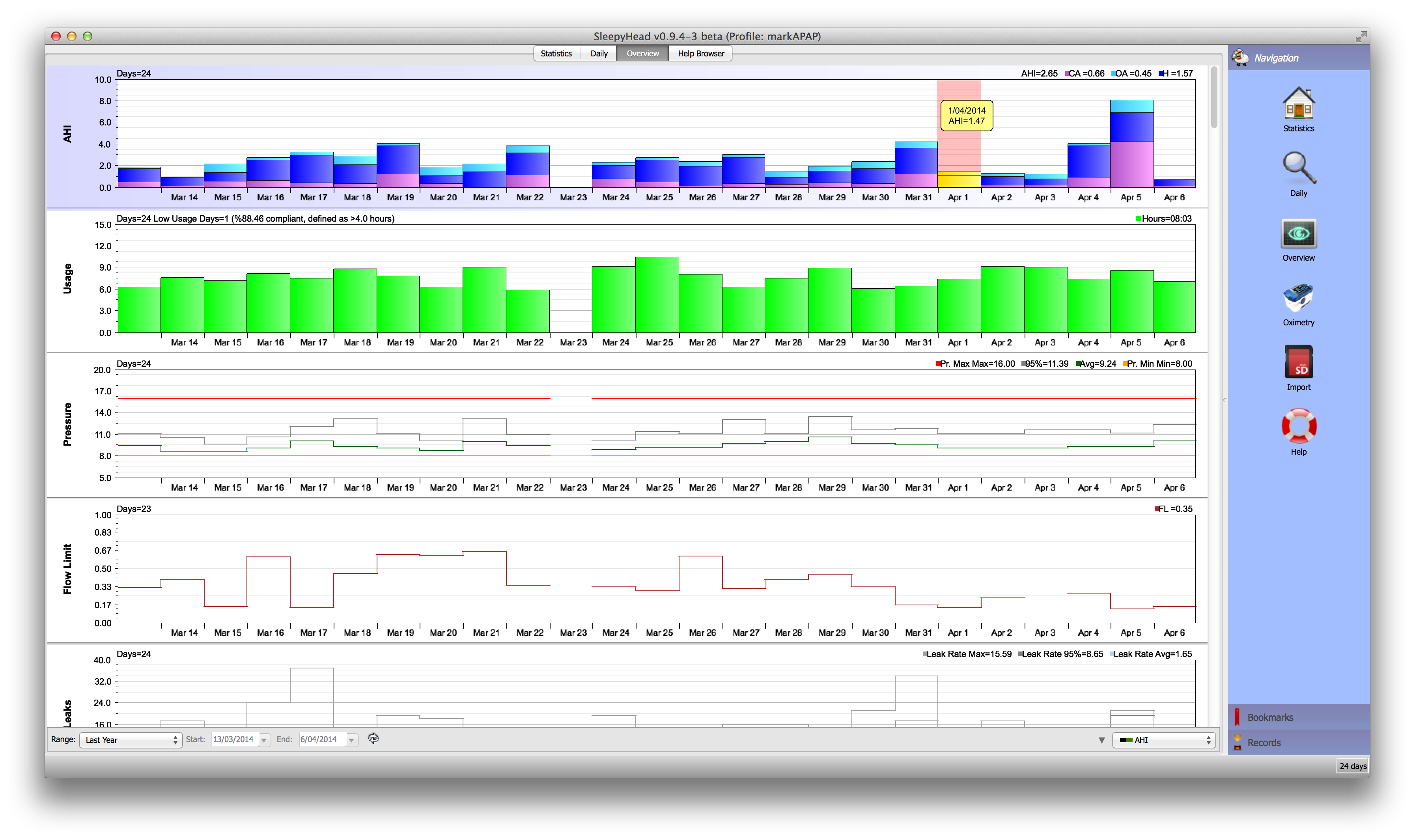
Open Source Data Analytics
Sleepyhead is an open source, patient downloadable tool created to get a deeper look into sleep data provided by CPAP machines. This software is used by many patients who want to dig deeper into their data and better understand the way they sleep.
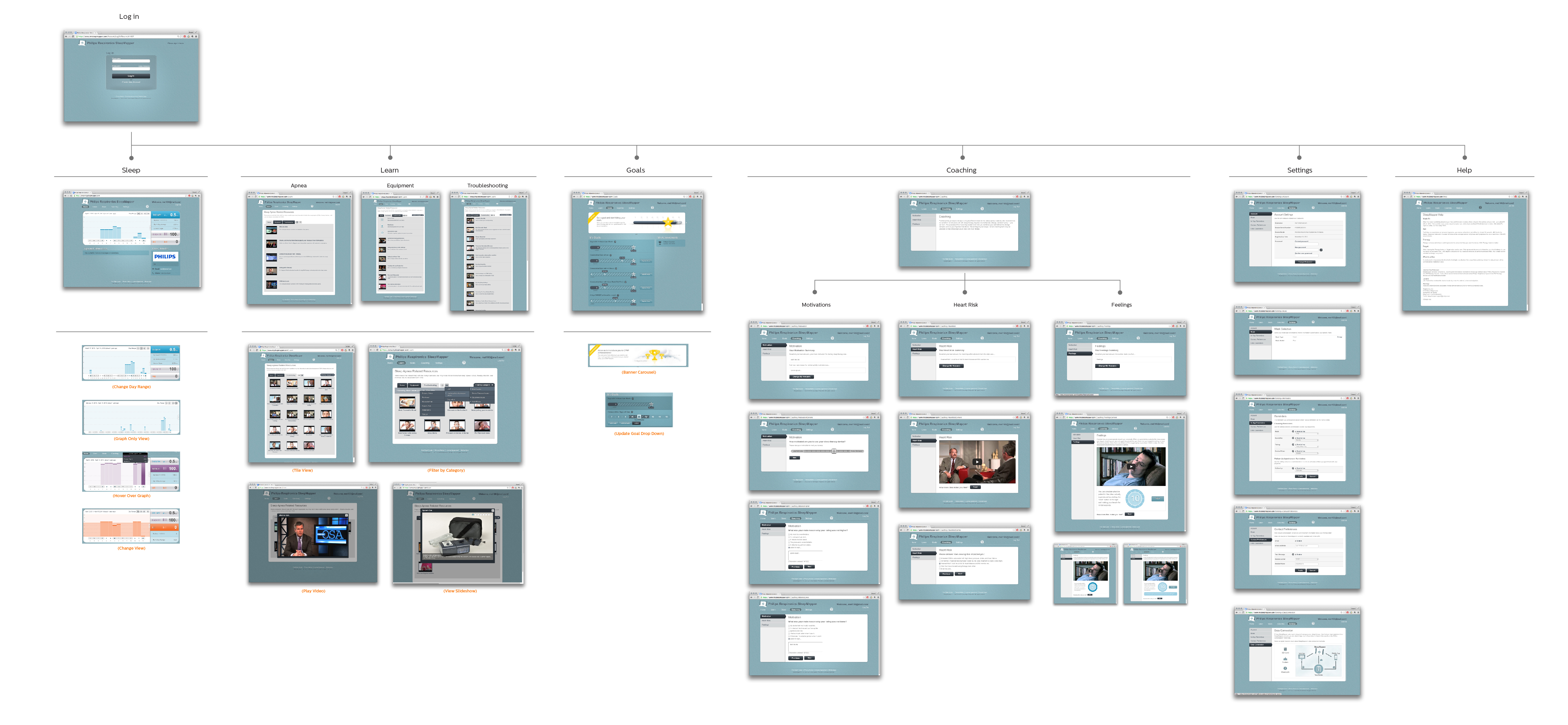
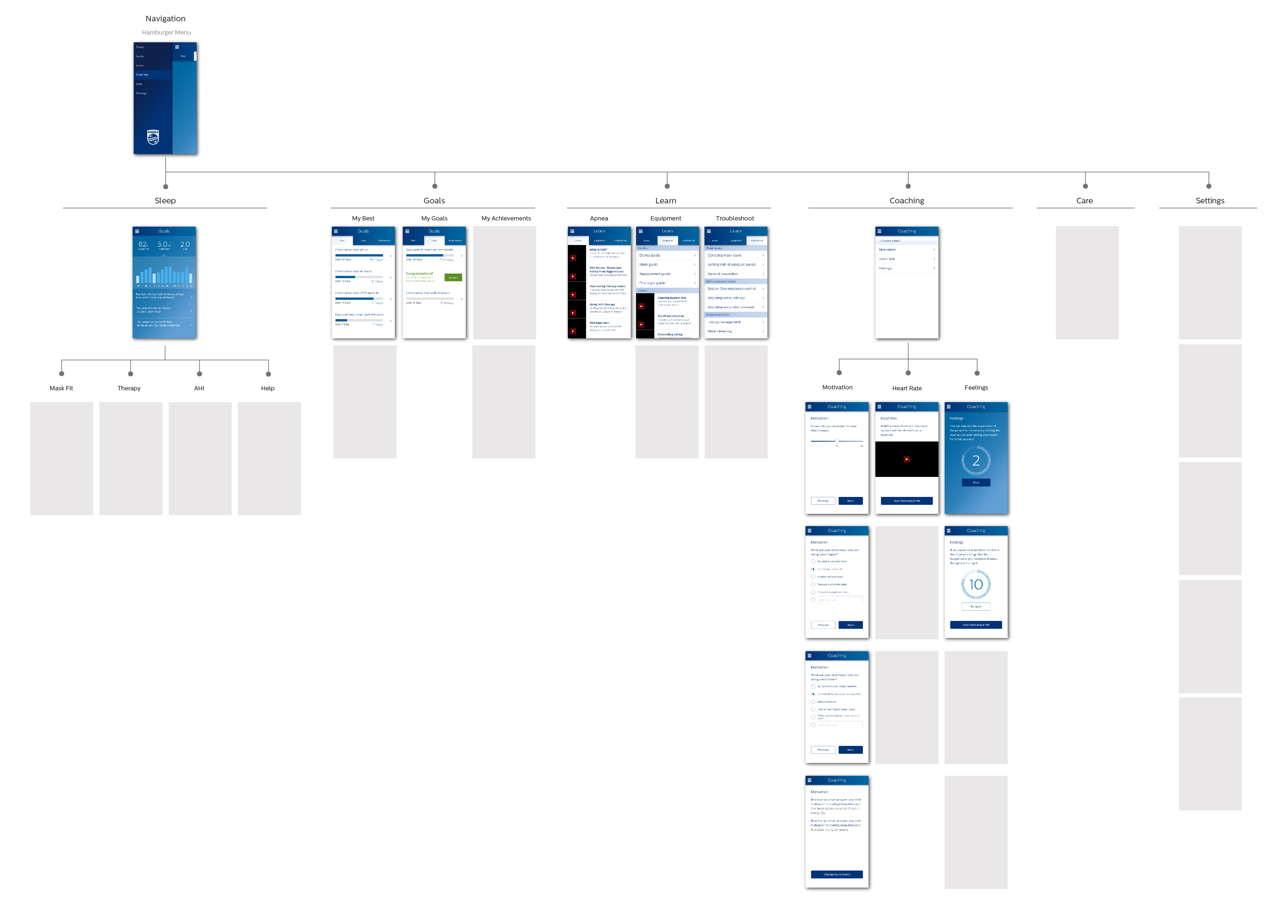
Mapping The Experience
We created a site map of the current solution to understand the most important areas of the application. We would use this as a gap analysis tool for when we created our on brand versions of the screens.
Exploring Our Brand
The challenge on this project became apparent as we explored our current Brand Architecture. Our web and mobile identities were both recently released, but they did not align in many aspects, nor did they support the needs of our business. First we would try to apply each brand identity.
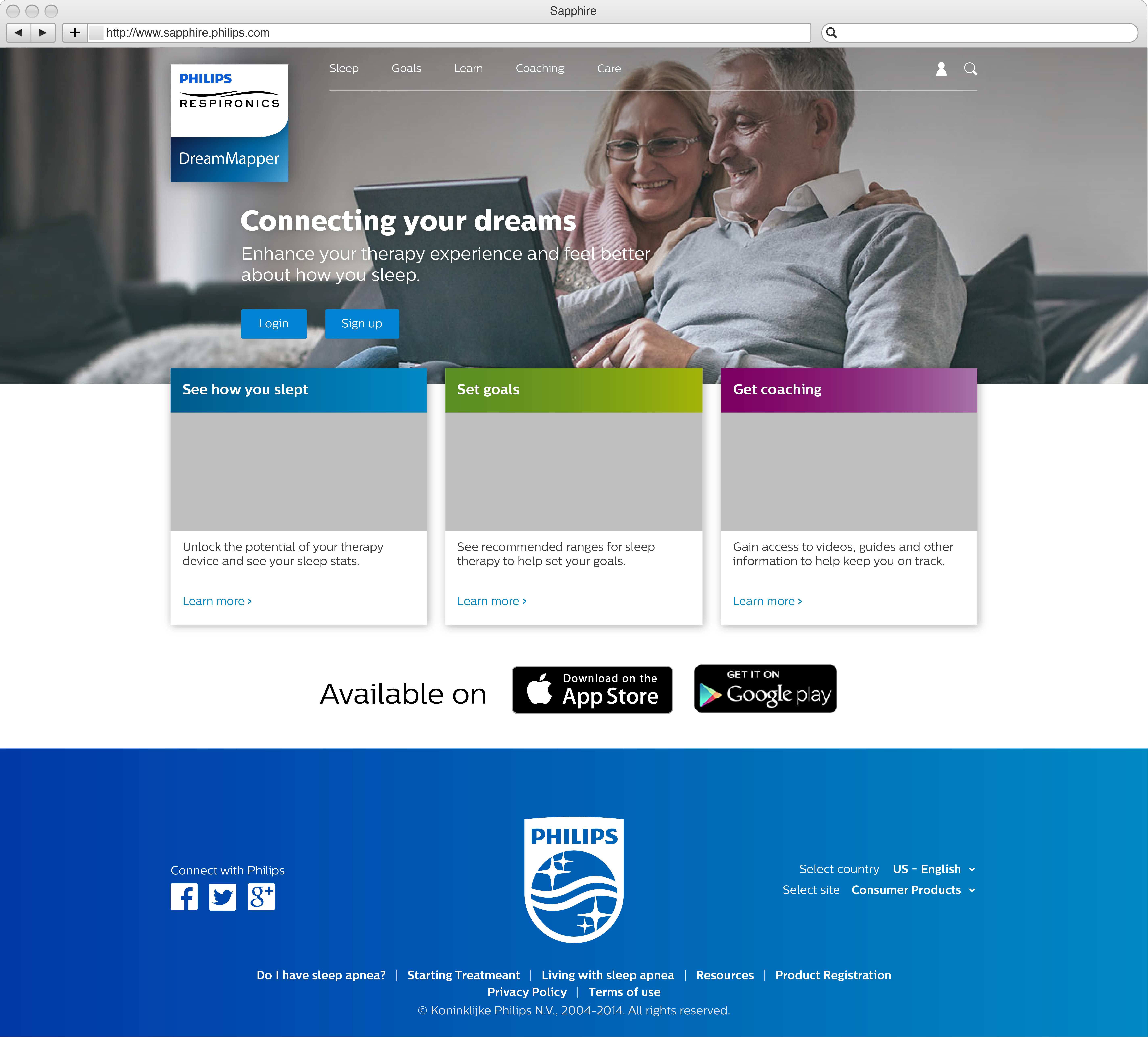
Applying The Brand
We did a quick pass on some of the assets with the current Brand Identity.
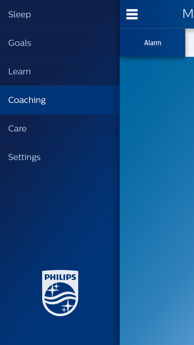
Deeper Dive Into The Brand
We applied many of the Brand Identity principles across the most important screens in both web and mobile. We then began mixing principles across each platform. We reached an initial direction that began to overlap both sets of guidelines in a way that felt meaningful to our Brand Identity as well as our category of sleep.
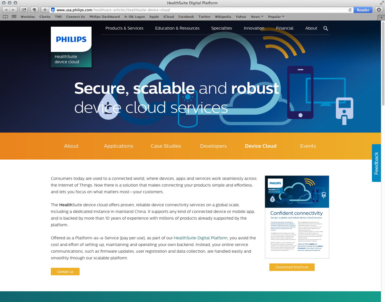
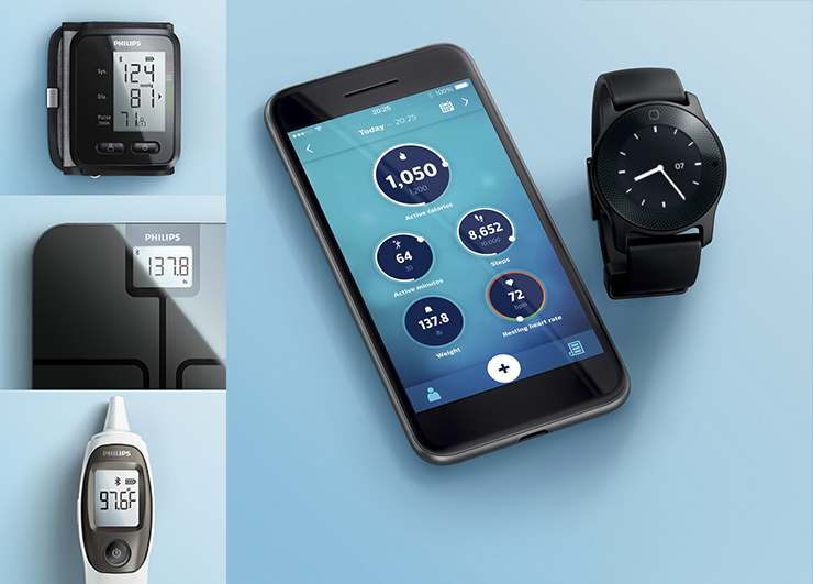
Reaching Out To HealthSuite
We reached out to collegues around the company to see what other application were in progress at this time. We stumbled upon a watch and platform called Philips HealthSuite which was to be the next release and an approach to bring together many points of data from multiple devices.
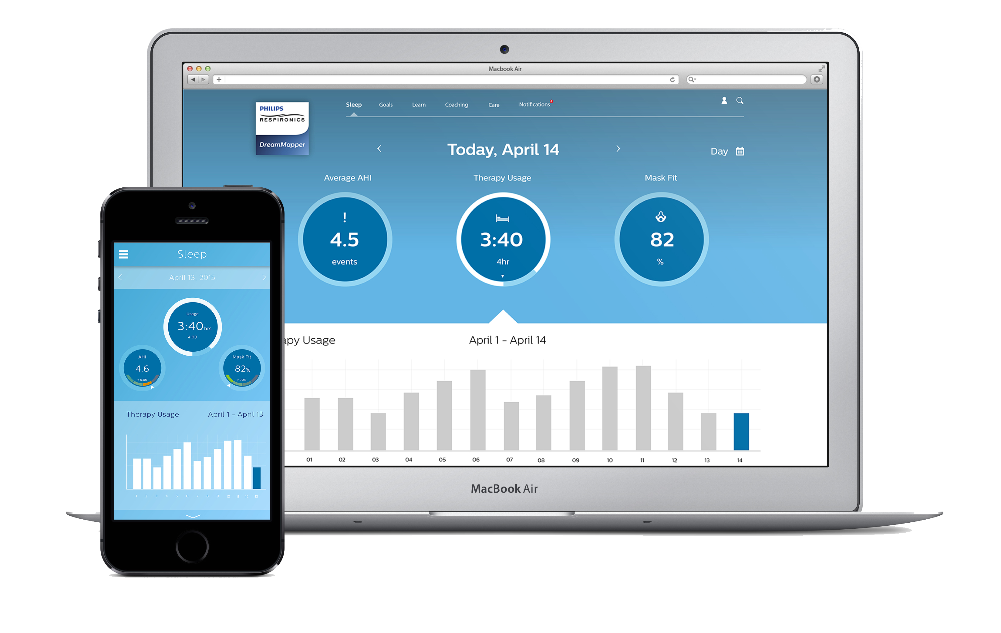
Testing The Styles
We created a version of our application utilizing the styles provided by the HealthSuite team. This would give us insight into how we could leverage the work they had done while creating consistencies in how data is viewed from Philips devices.
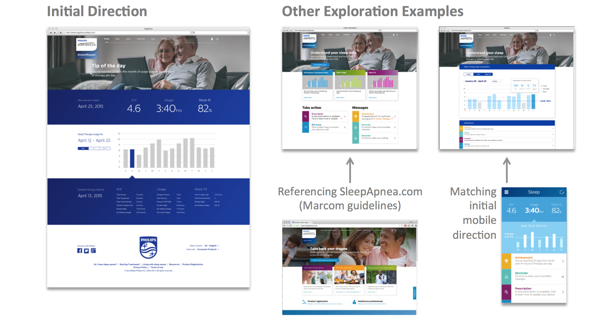
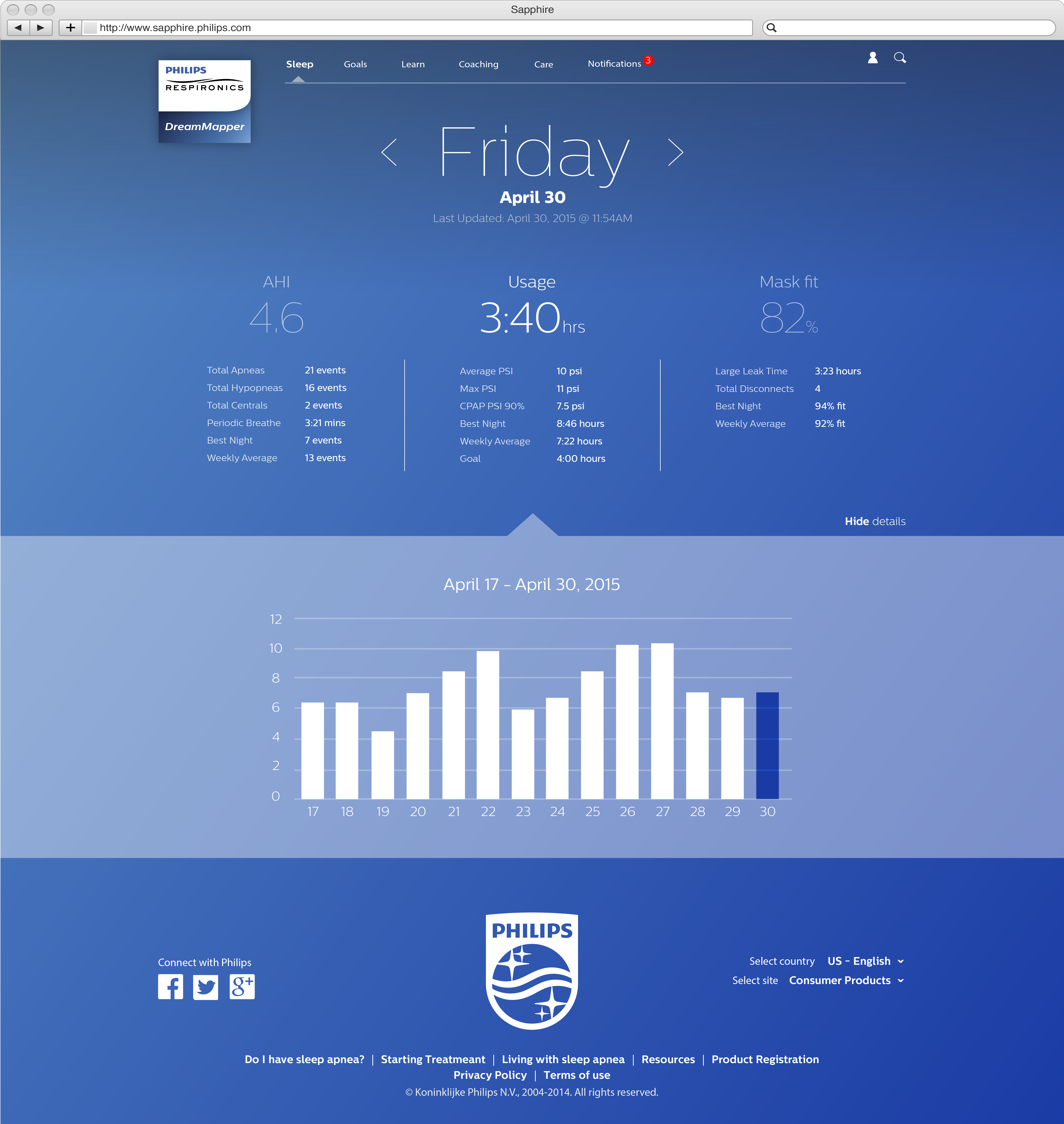
Forging Our Own Path
After many internal discussions, we came to the conclusion that the HealthSuite styles were not appropriate for the users of our devices. We decided to create a new style that overlapped both web and mobile identities while drawing on some of the ways HealthSuite handled showing data.
Populating The Map
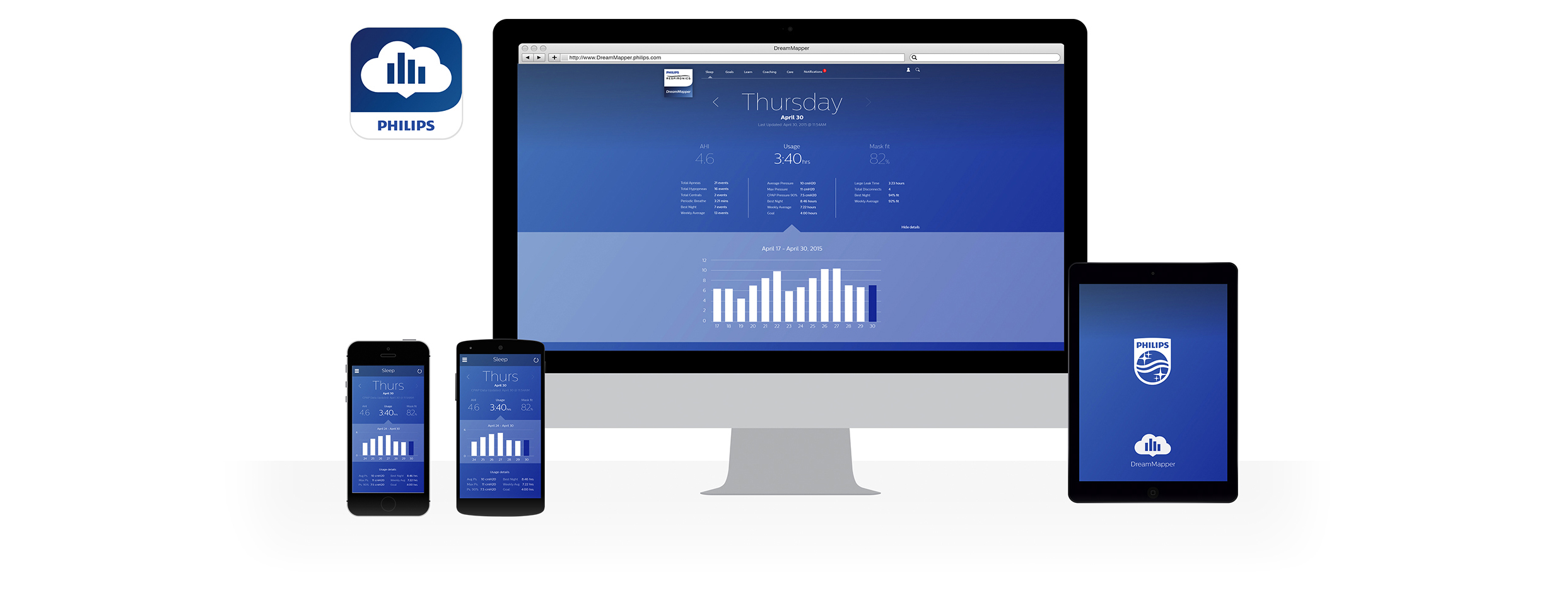
We had internal reviews with our Brand team as well as leadership from our team to decide on our direction. Once our decision was made, we began applying the styling accross all the different screens. Below was a snapshot while we were creating and filling in the gaps in screens.
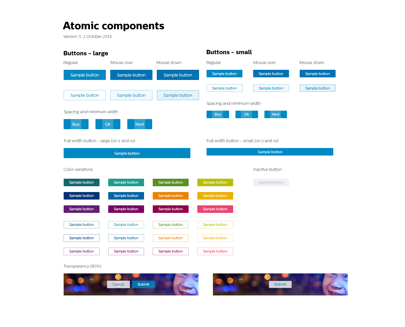
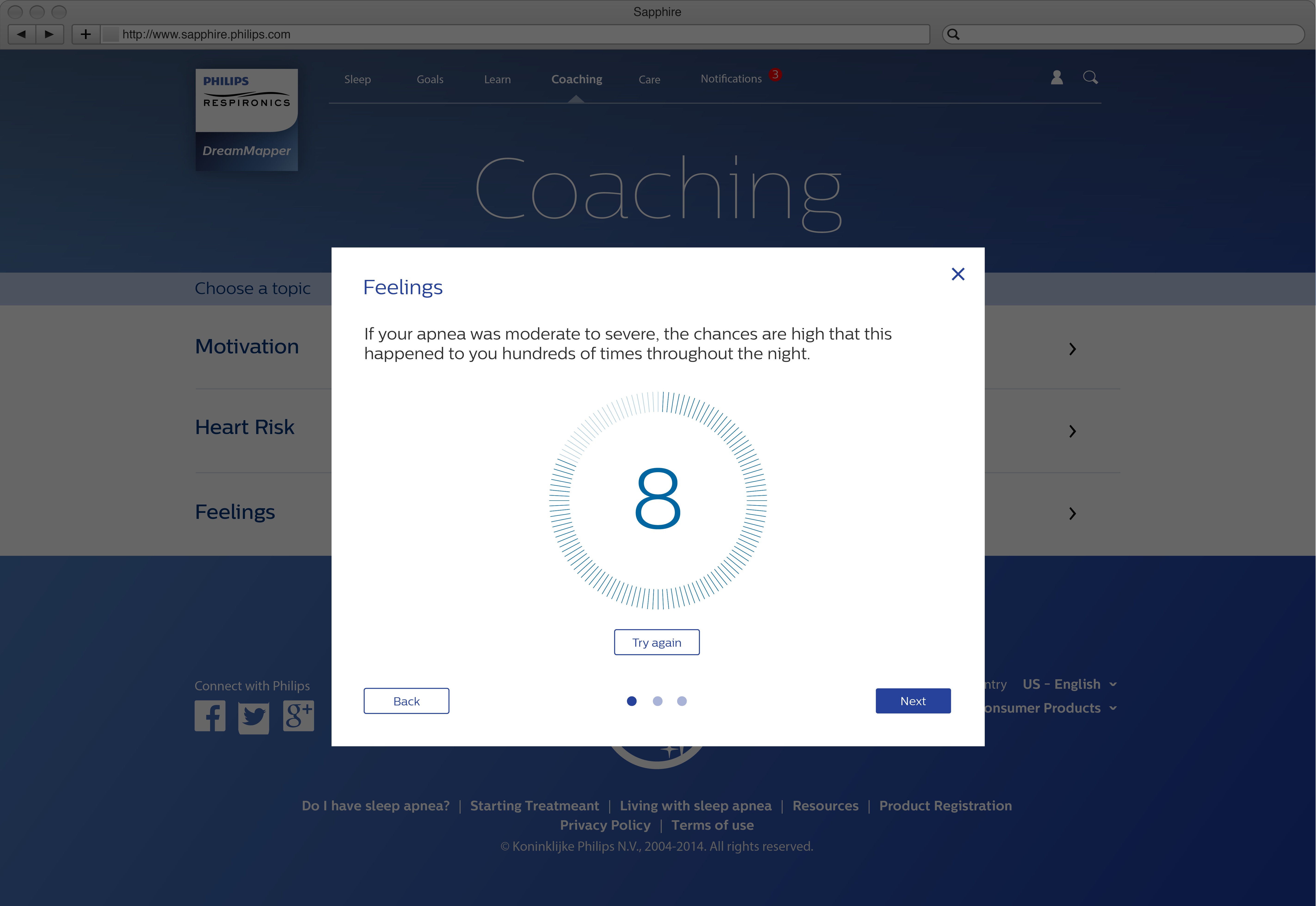
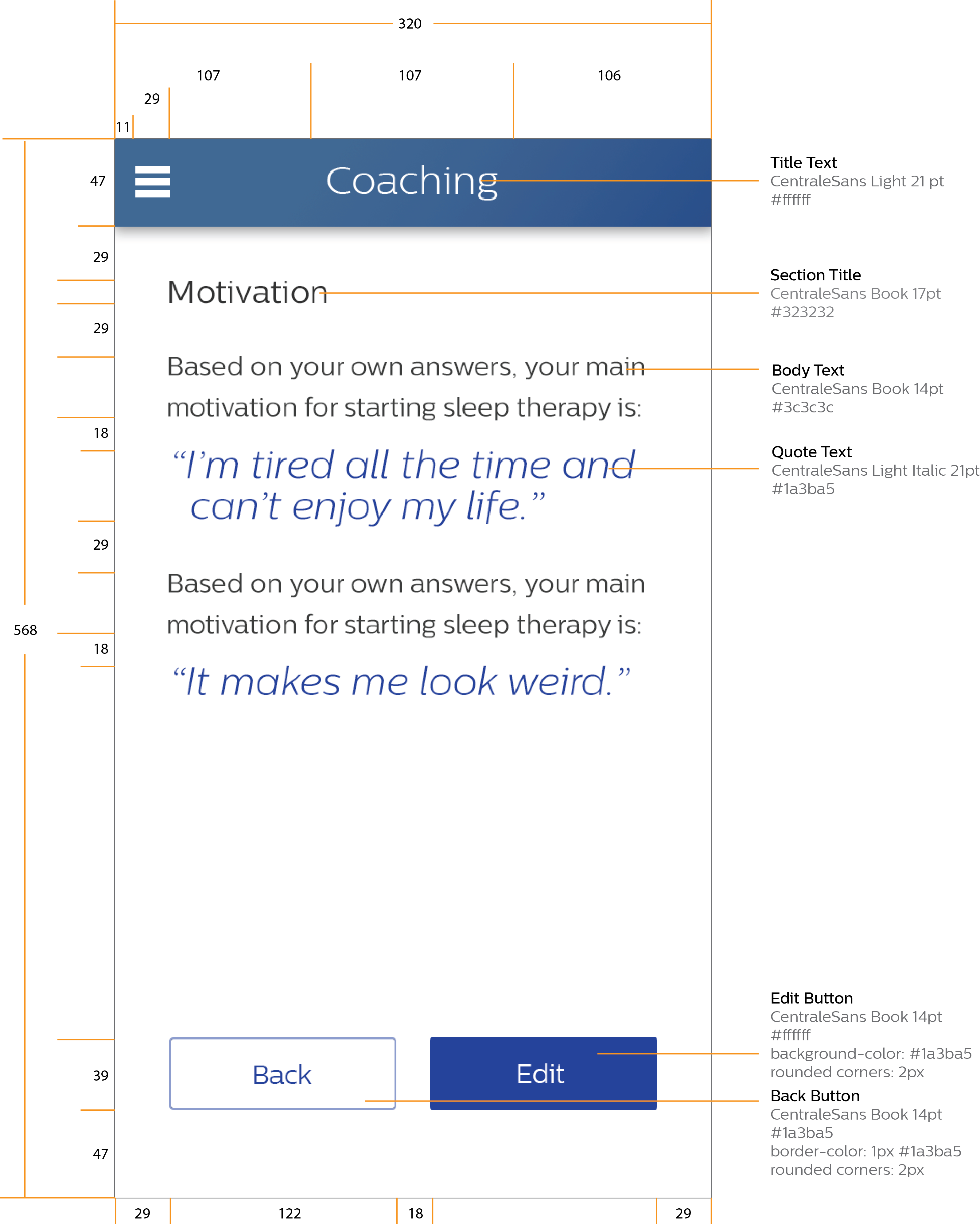
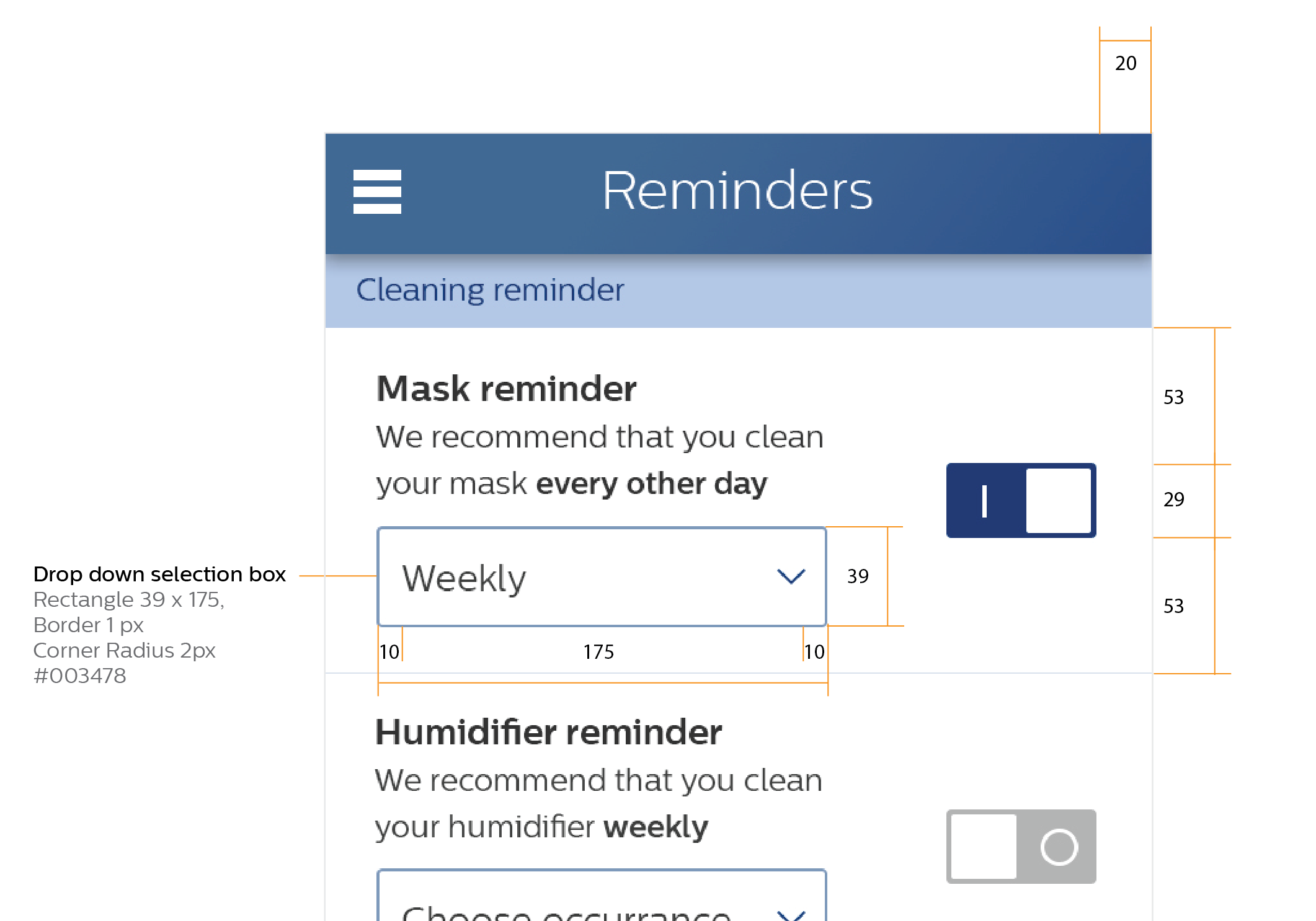
Speccing Our Designs
We created detailed spec sheets to deliver our design intent. This would aid the developers in implementing our design and it would ensure that we would cover any of the questions they may have about how to acheive our design goals.
Project Outcome
We delivered design intent and assisted the development team during their implementation until the project was released. DreamMapper very positively received and is highly rated on both iOS and Android with an average rating over 4 stars and more than 34k reviews.