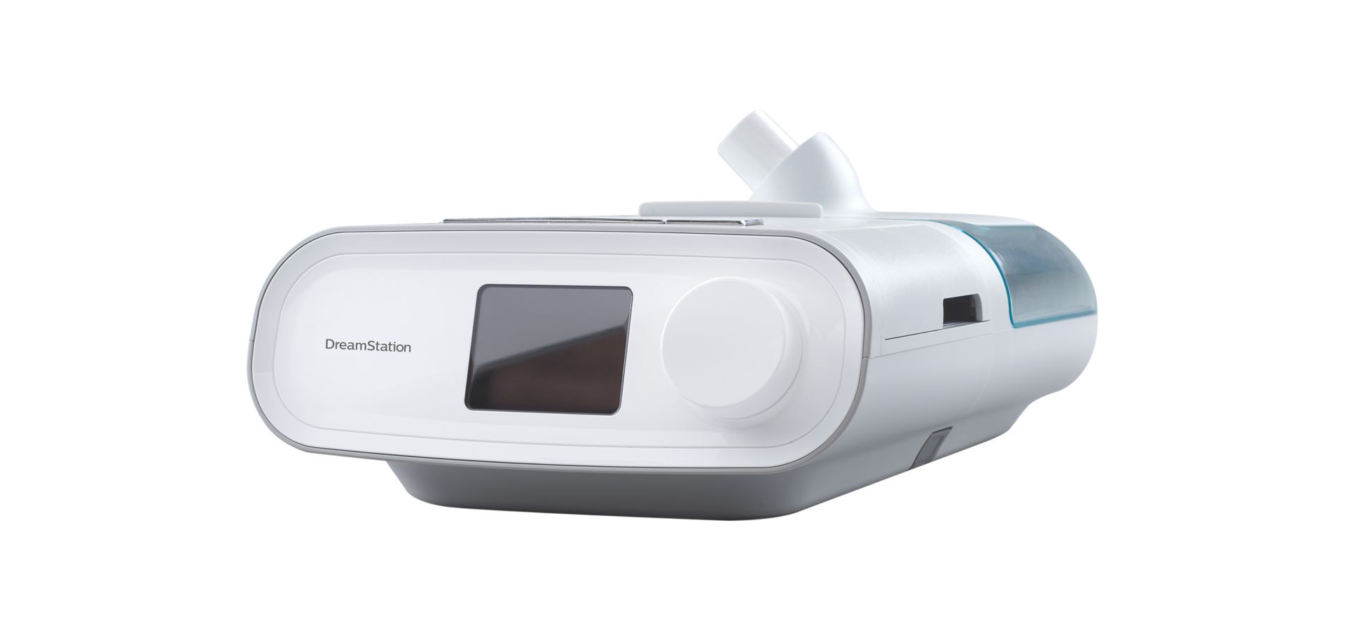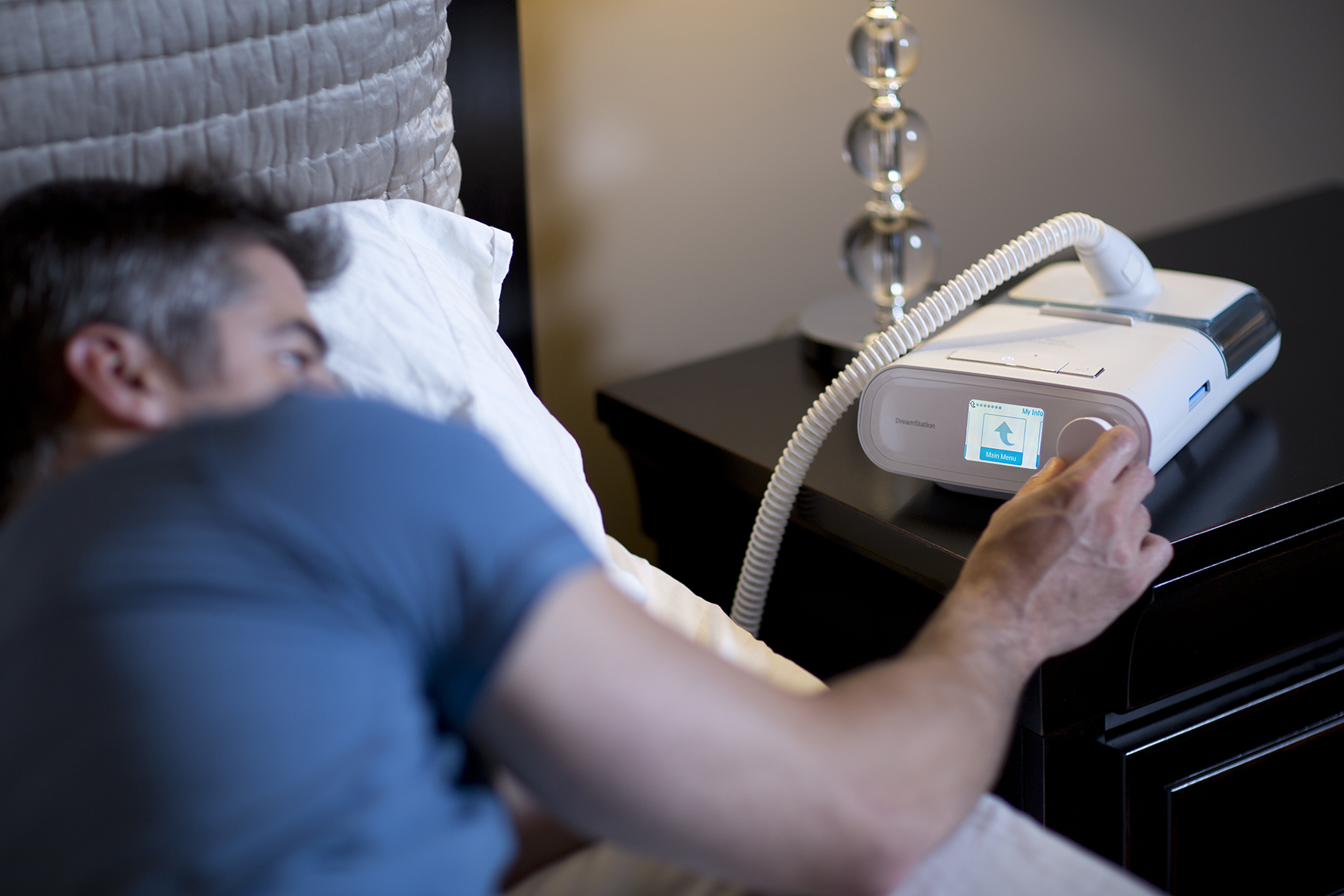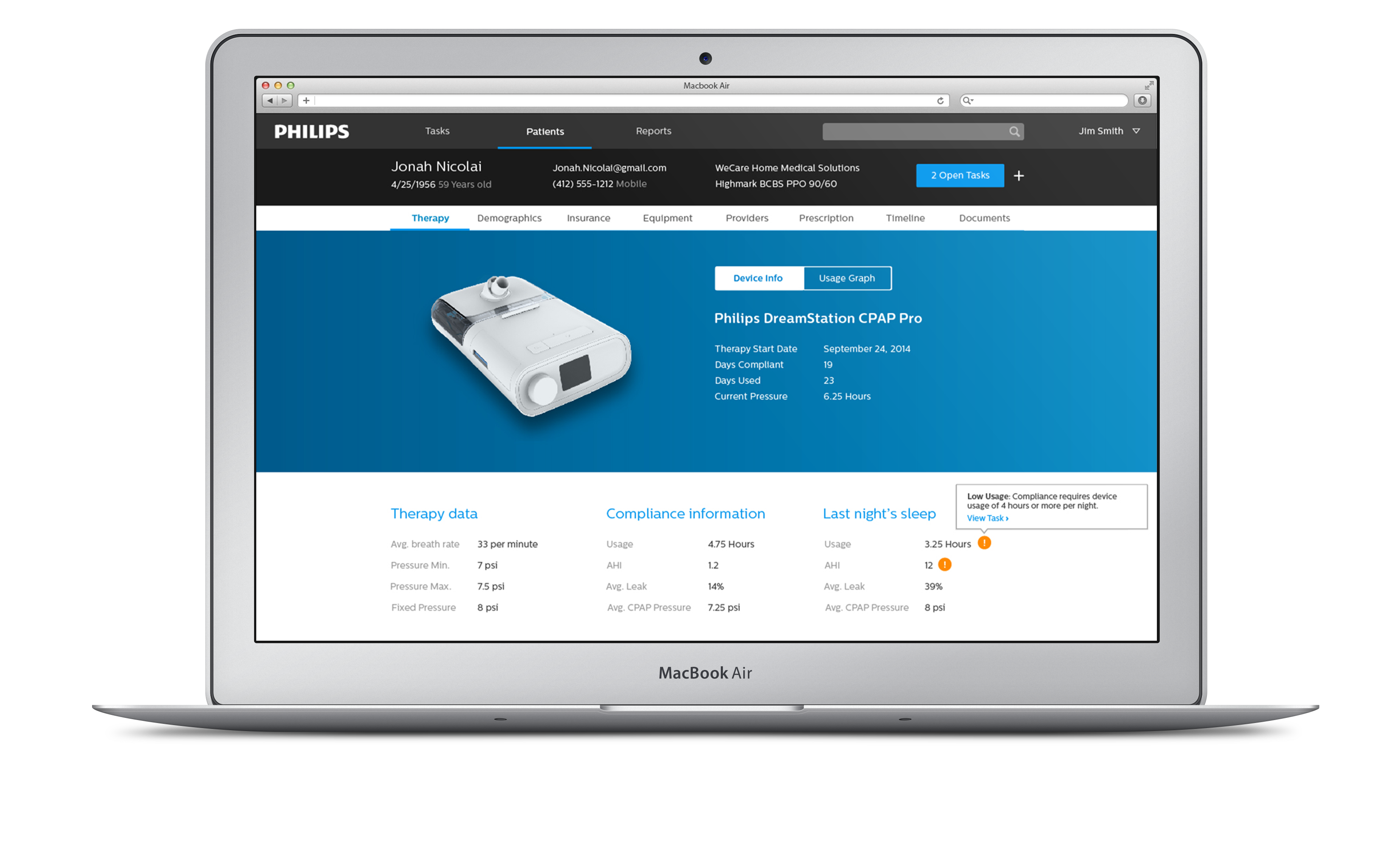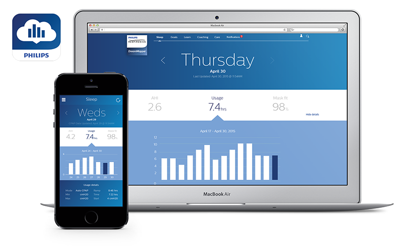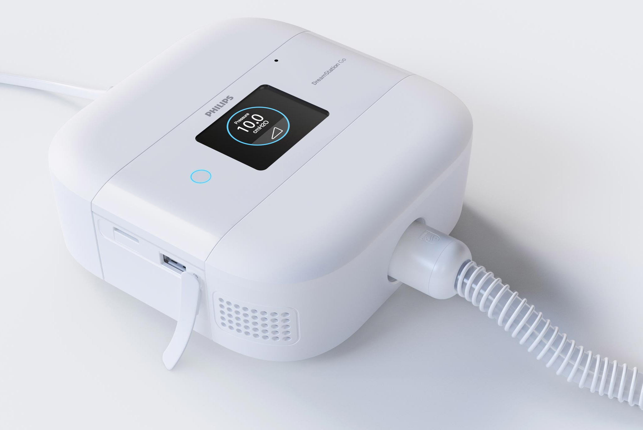
The DreamStation CPAP device is a next generation flagship product for patients with obstructive sleep apnea. This product is used by millions of users every night to receive therapy to treat a dangerous medical condition affecting 22 million Americans and it's estimated that 80% of cases are undiagnosed.
Initial Colors and Icons
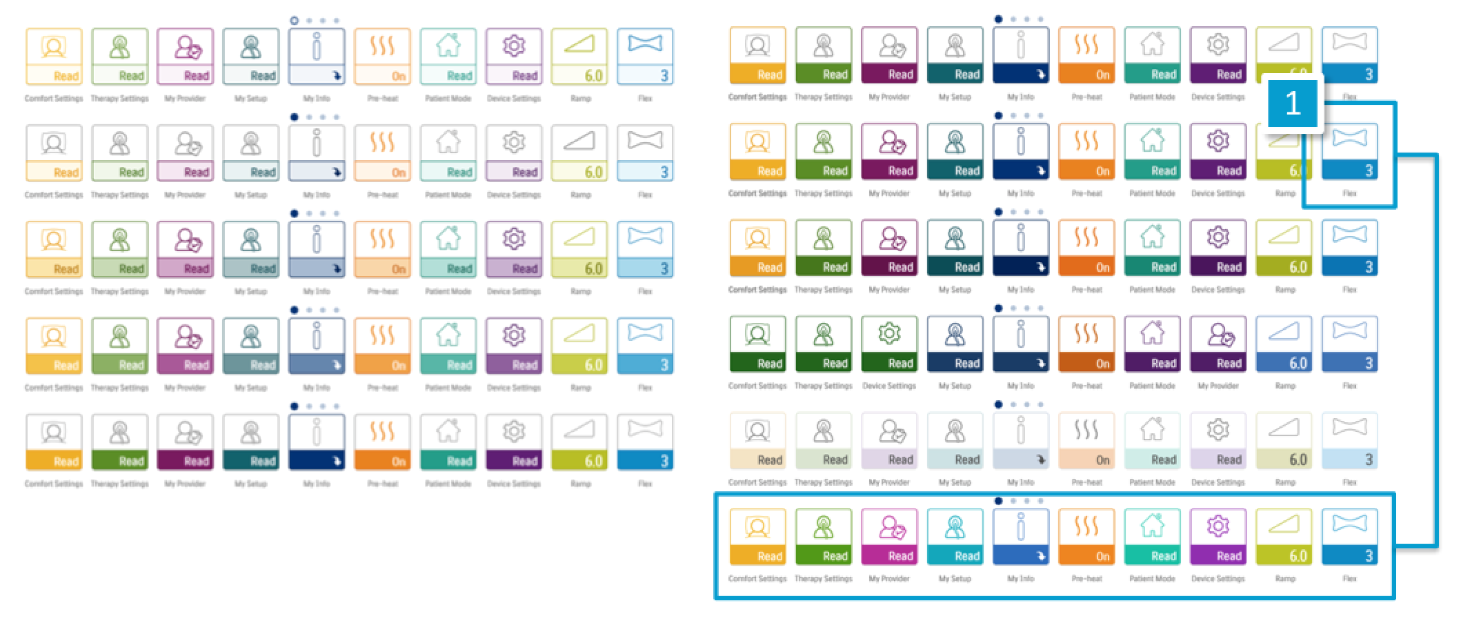
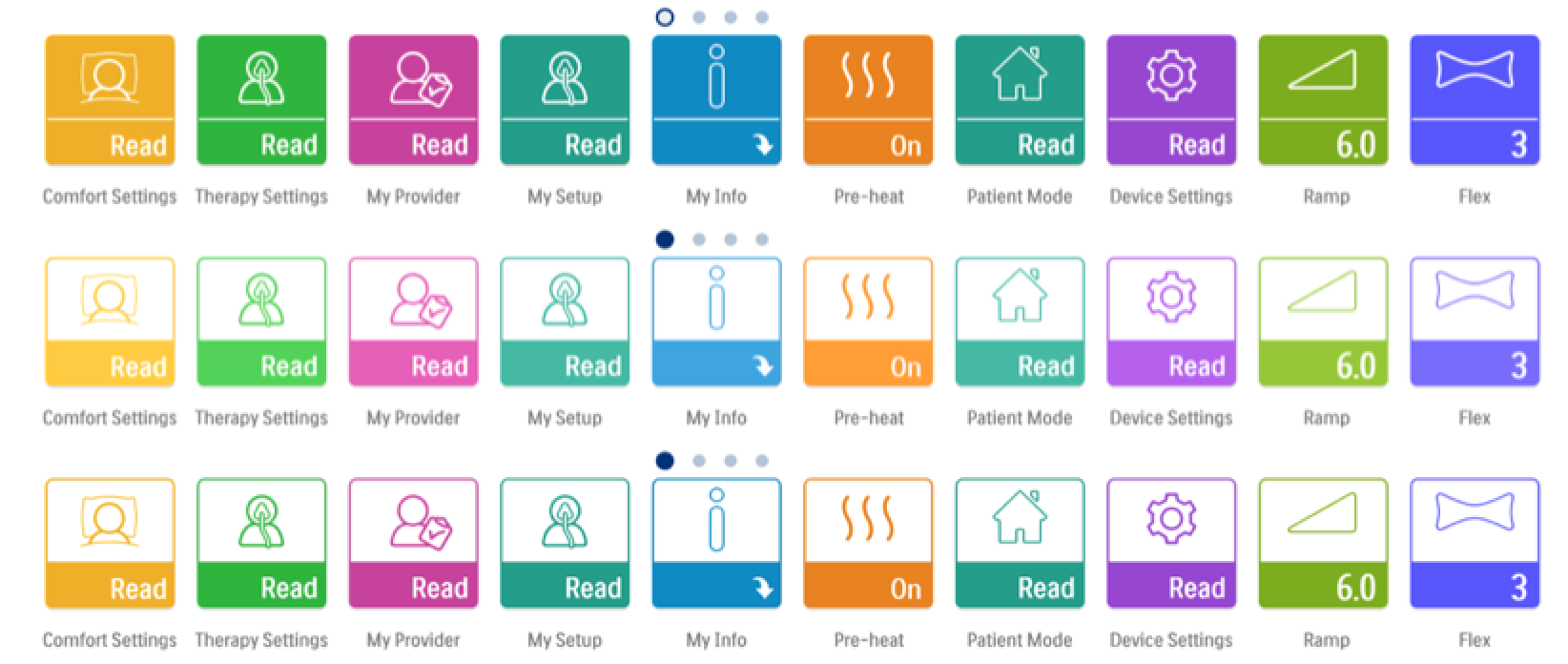
When I entered the project I did an assessment of the current landscape of icons and color used to date. The preview given here shows the gaps that were apparent from the start. The icons were a mix of differing line weights and outline vs solid icons. Colors on the device were very washed out and pastel which was not in line with out Brand Identity.

Mobile Identity Palette
I began exploring the available palettes within our different Brand Identities. Starting with the new Mobile Identity, I began applying both the colors and the line art style inconography.

Experience Identity Palette
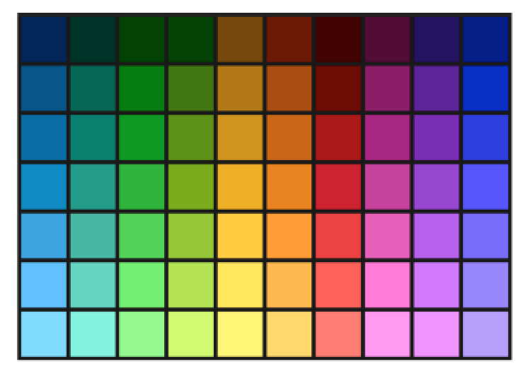
I then reached out to our global team to see what work was being done with colors in other categories within the company. I stumbled upon a group that was working on the next generation style guide, which contained the Experience Identity Palette.
Finding The Baseline
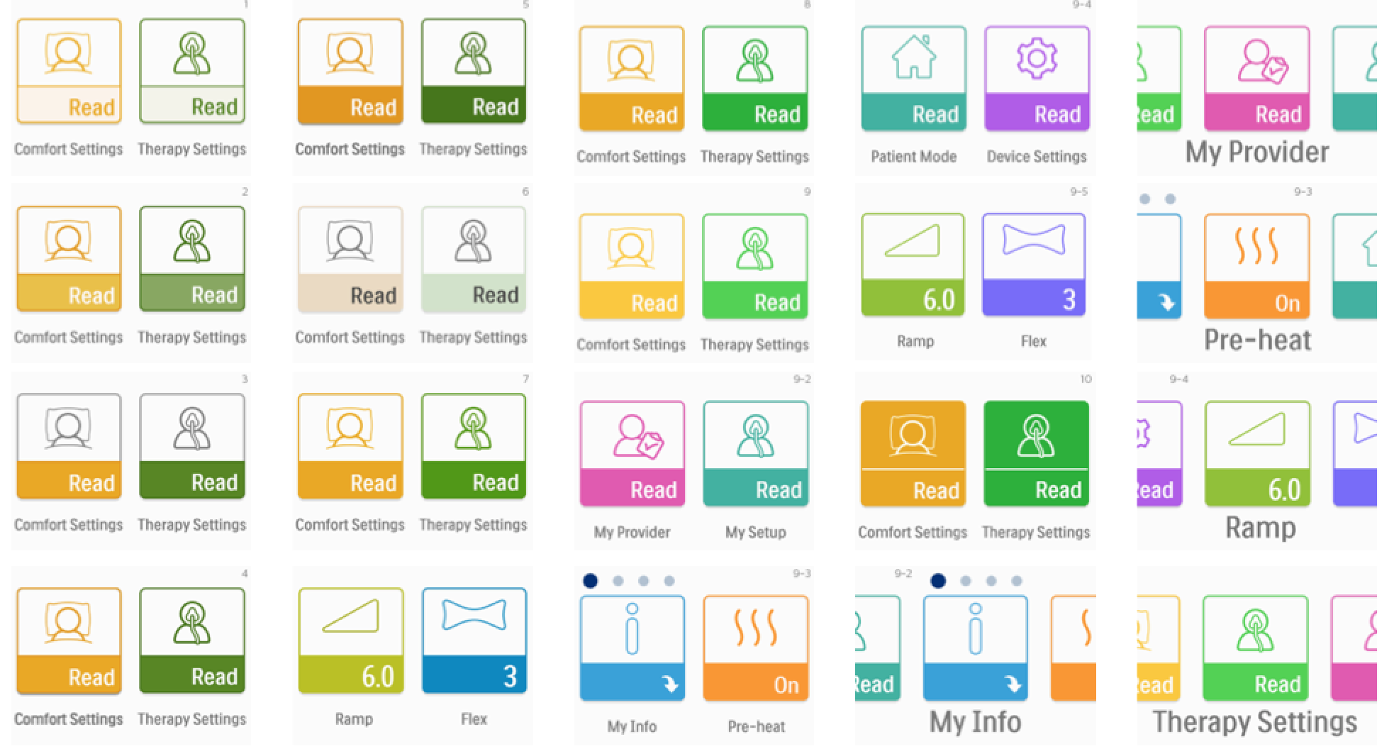
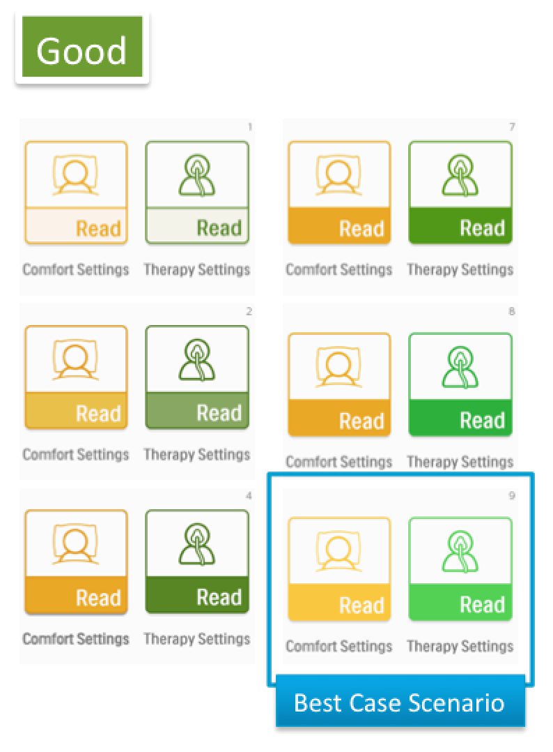
This new palette had a much wider range of colors available, which gave me ample options. I needed to find a baseline for application on the embedded system. To do this, I created multiple sets of concepts around varying levels of color from the palette. Once I honed in on the baseline, I took those colors and applied them to the new icons. I also created varying concepts of how to apply the color.
Normalizing Our Palettes
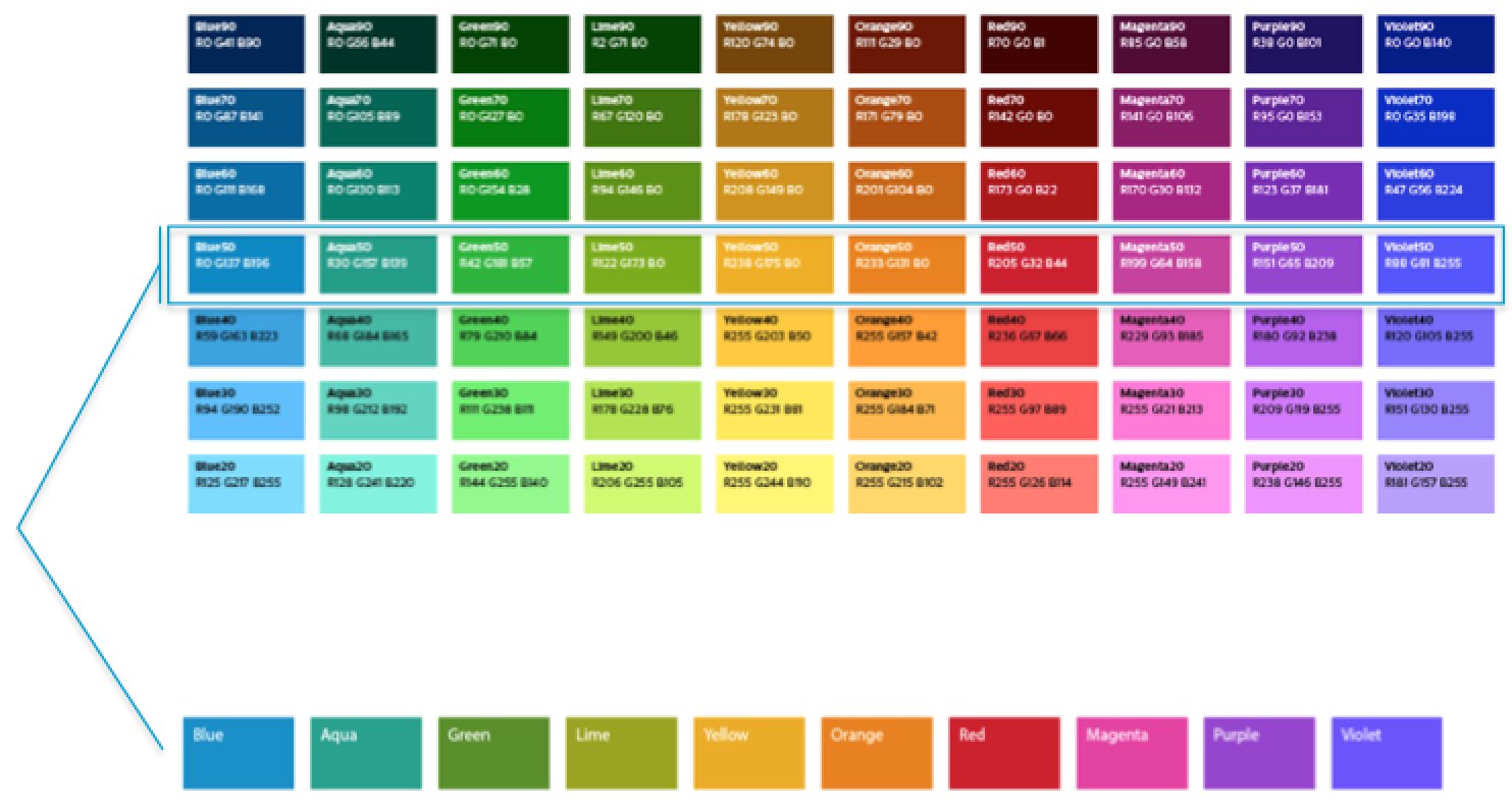
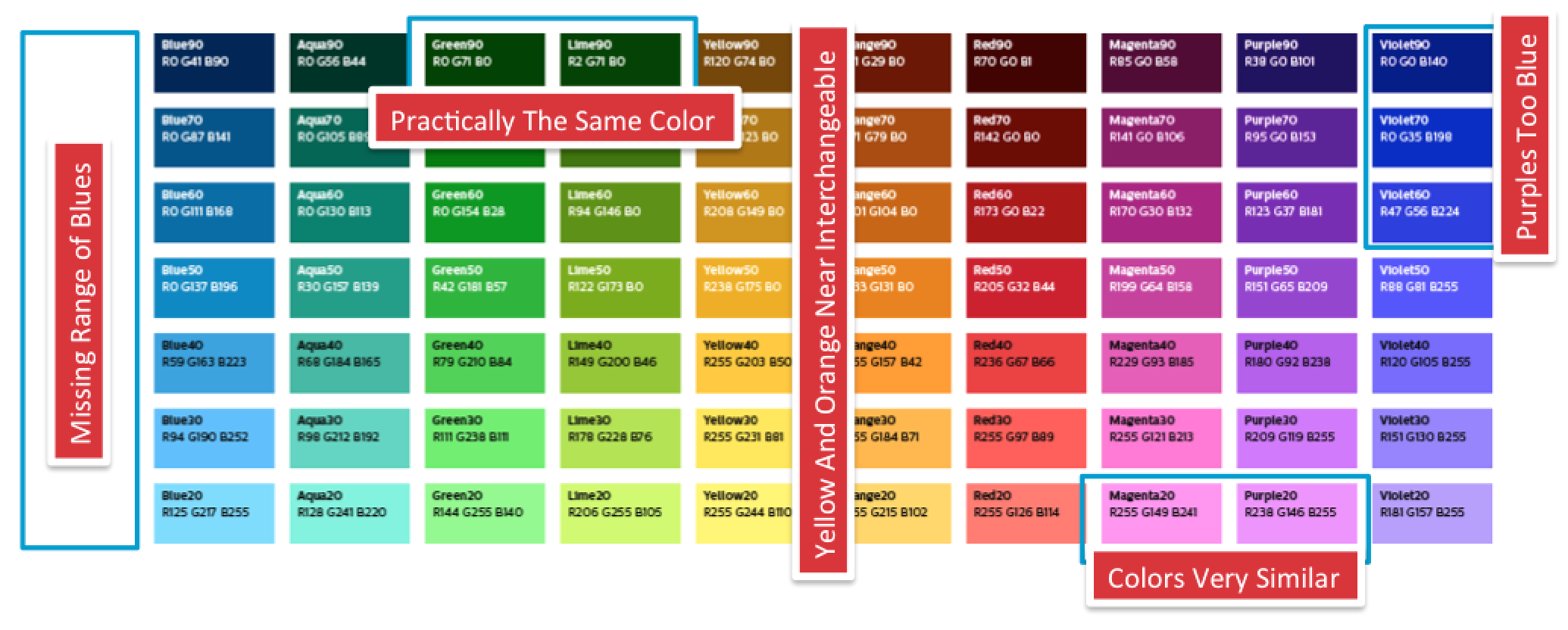
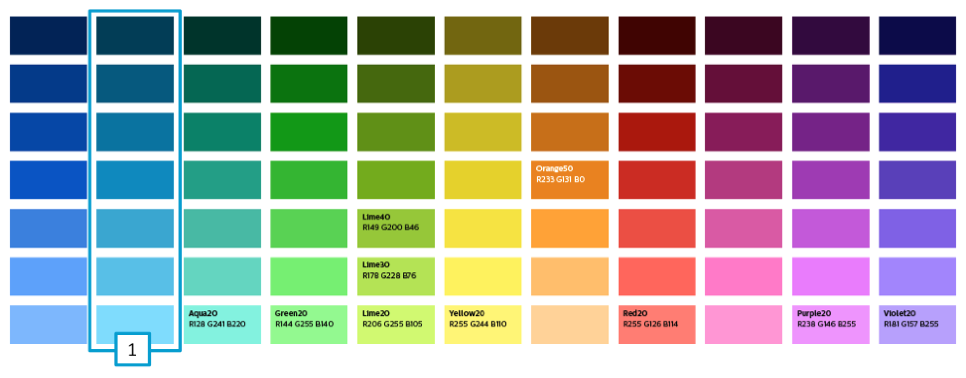
This exploration led me to realize that the colors in our palettes had many gaps. Since these colors were a work in progress, I decided to dig deeper into how we would improve this palette. I took the approach of choosing a hue for each color then adjusted the brightness and saturation levels to create consistency across each band. This was then shared back to the global team to see how we could improve our brand coloring.
Portfolio Alignment
My next step was to see how the colors we were using would align with the rest of our Sleep and Respiratory Care portfolio. We also took learnings from the color exploration and adjusted other work in progresses in our group.

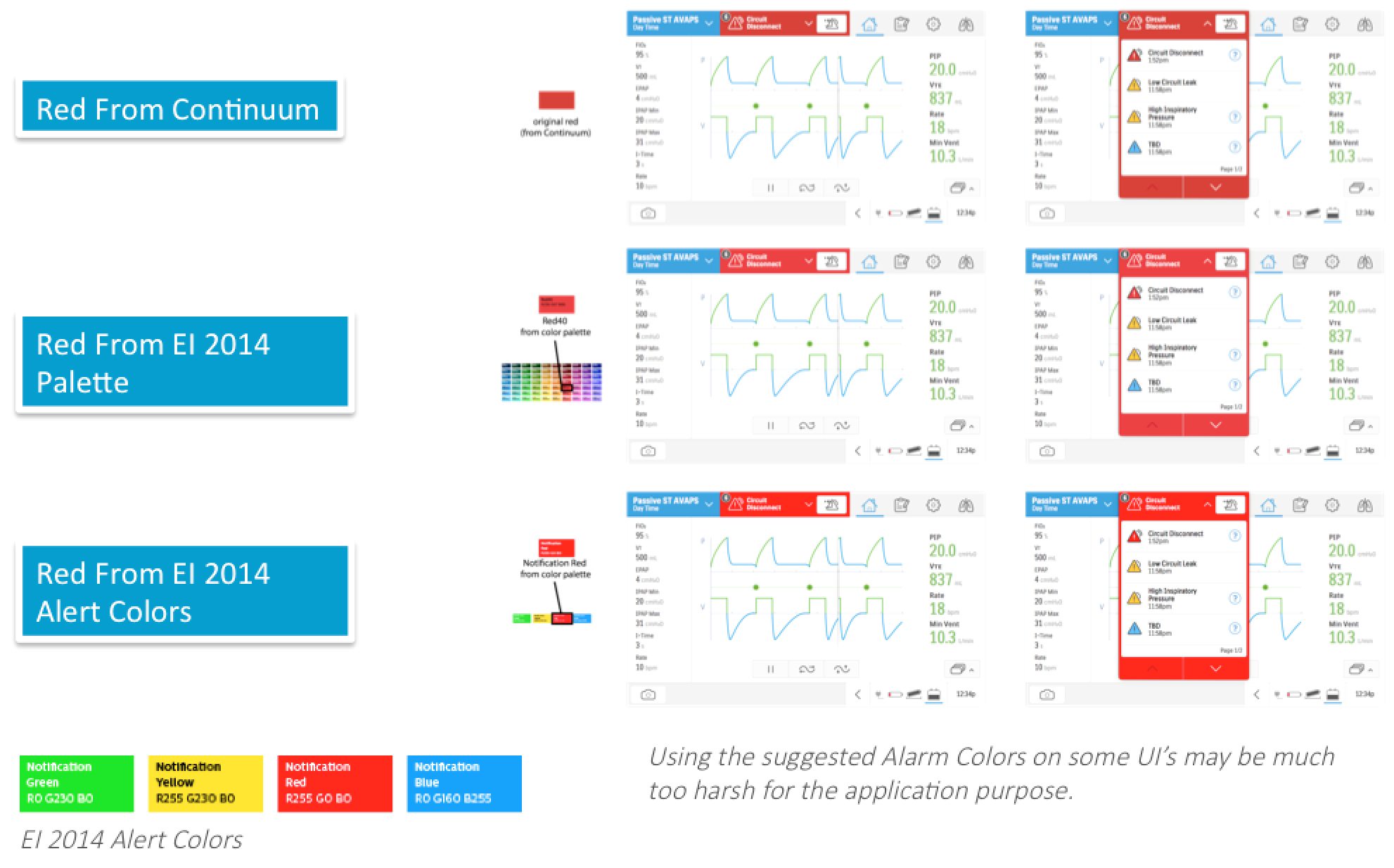
Making The Decision
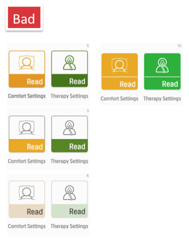
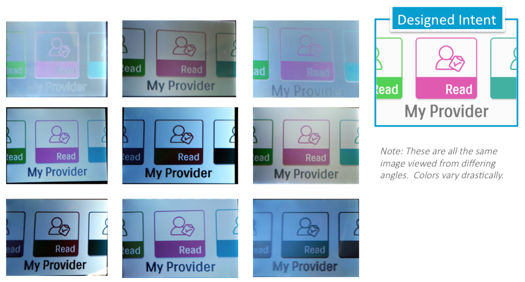
Taking different ranges of colors and possible applications, I did a cross comparison for legibility, brightness and overall friendliness. This was all done on a physical prototype screen that was able to be loaded via a USB drive with concept screens. The embedded screen actually reproduced colors at a darker level, so I raised my baseline of colors up by one level.
Testing The Direction
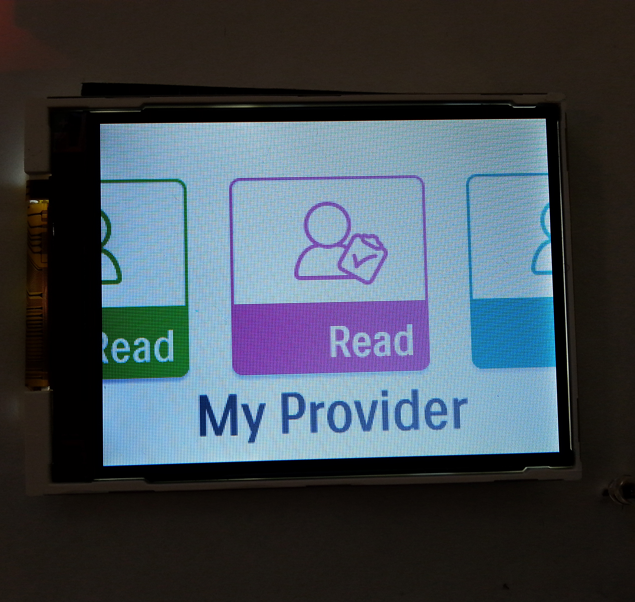
I then applied the new range of colors across a set of test screens and updated the icons and assets. I then loaded these images onto the embedded test screen. I put the test screen into a light box at multiple angles and under different lighting to assess quality and visibility for each color.


Project Outcome
Once the new colors were approved, I proceeded to apply and update all assets for the project and provide them in the correct format for implementation. We launched the product to great review and received an IF Design Award in 2016.
