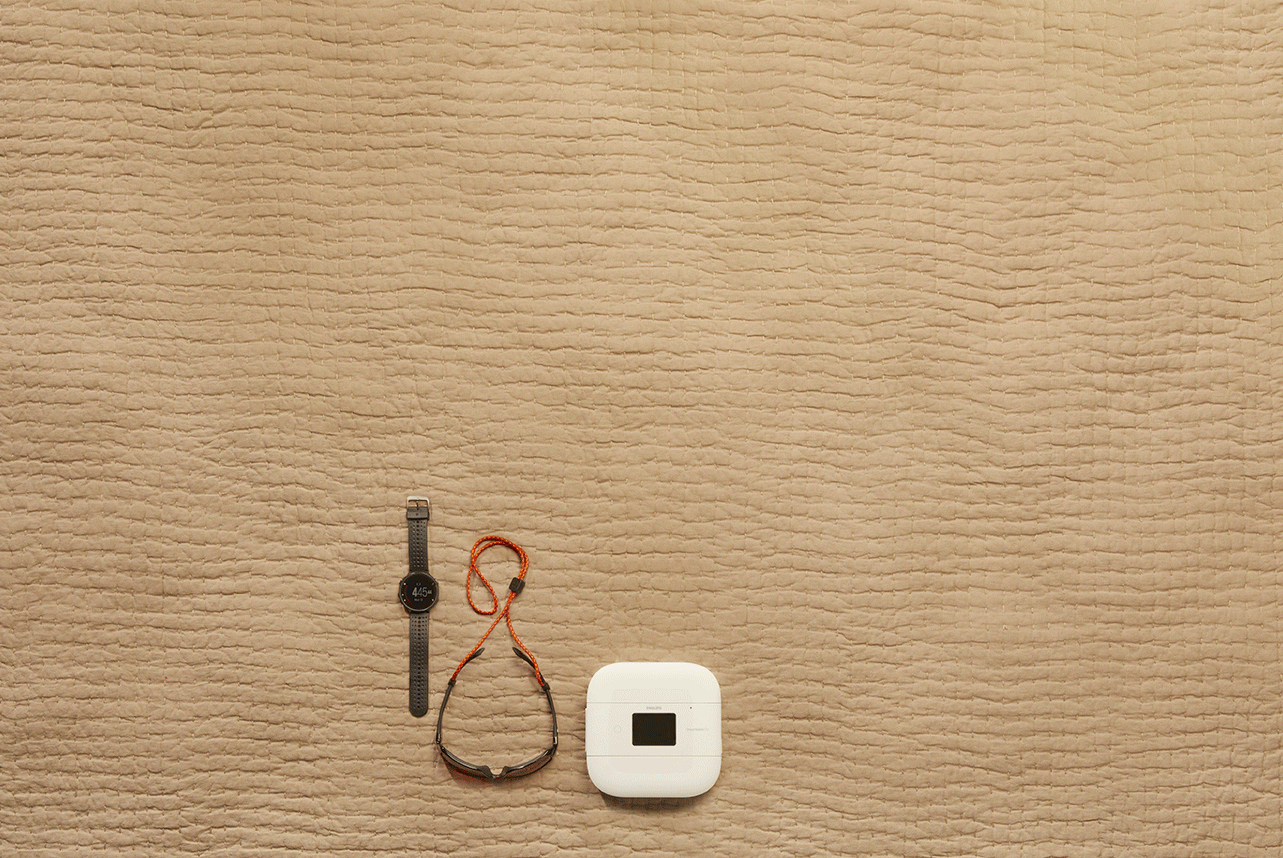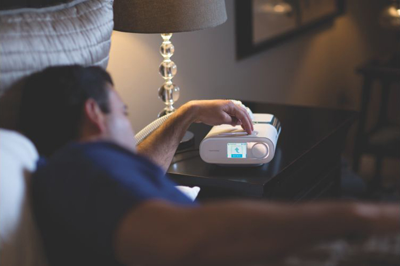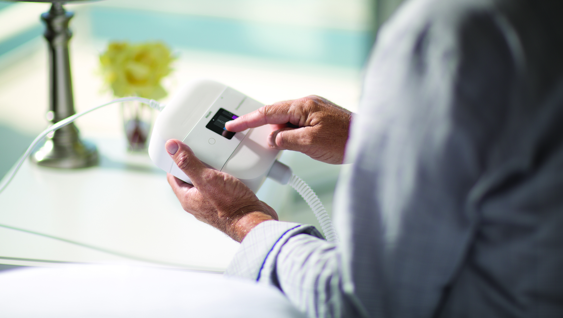
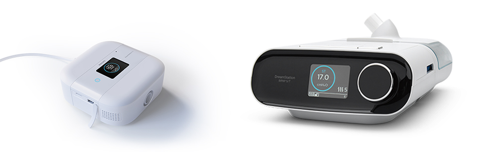
The DreamStation Go CPAP device is a modular travel system for patients with obstructive sleep apnea. This product is meant to ease the stresses of traveling with bulky devices, tubes and power bricks by greatly reducing the size of the device and combining many of it's components to make it travel ready.
Transforming Our Flagship
The ask to Design was to take our existing flagship CPAP device UI and modify it's interactions to be suitable for the touch screen beign applied to DreamStation Go. The new product would be focused on travel and would have a modular structure for attaching a portable battery pack and other accessories so flexibility in interactions would be extremely important.
Outlining the Needs
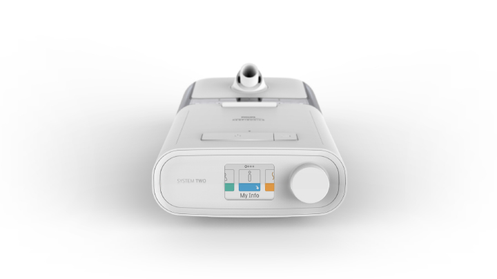
We began assessing the different areas of focus across the DreamStation user interface. My experience working with the DreamStation UI proved valuable in understanding the structure of the assets that would need changed.
Exploring Physical Paradigms
Pressure from the project team required that we make quick decisions on a physical navigation paradigms. I jumped into creating many versions of how we could control the new device, a few of which are below.
Touch Capacitance Only
I explored how we could keep the interaction elements outside of the screen to preserve the small screen real estate for easier visibility. This example shows how we could use a track wheel and button paradigm for navigating as well as touch capacitive buttons for starting therapy and ramp.
Touch Capacitance and Touch Screen
I then explored how we could combine both external interactions with a touch screen interface. This proved to be a great way of giving enough separation of repetitive motion from the screen while giving the natural simplicity of being able to touch the item you want to select.
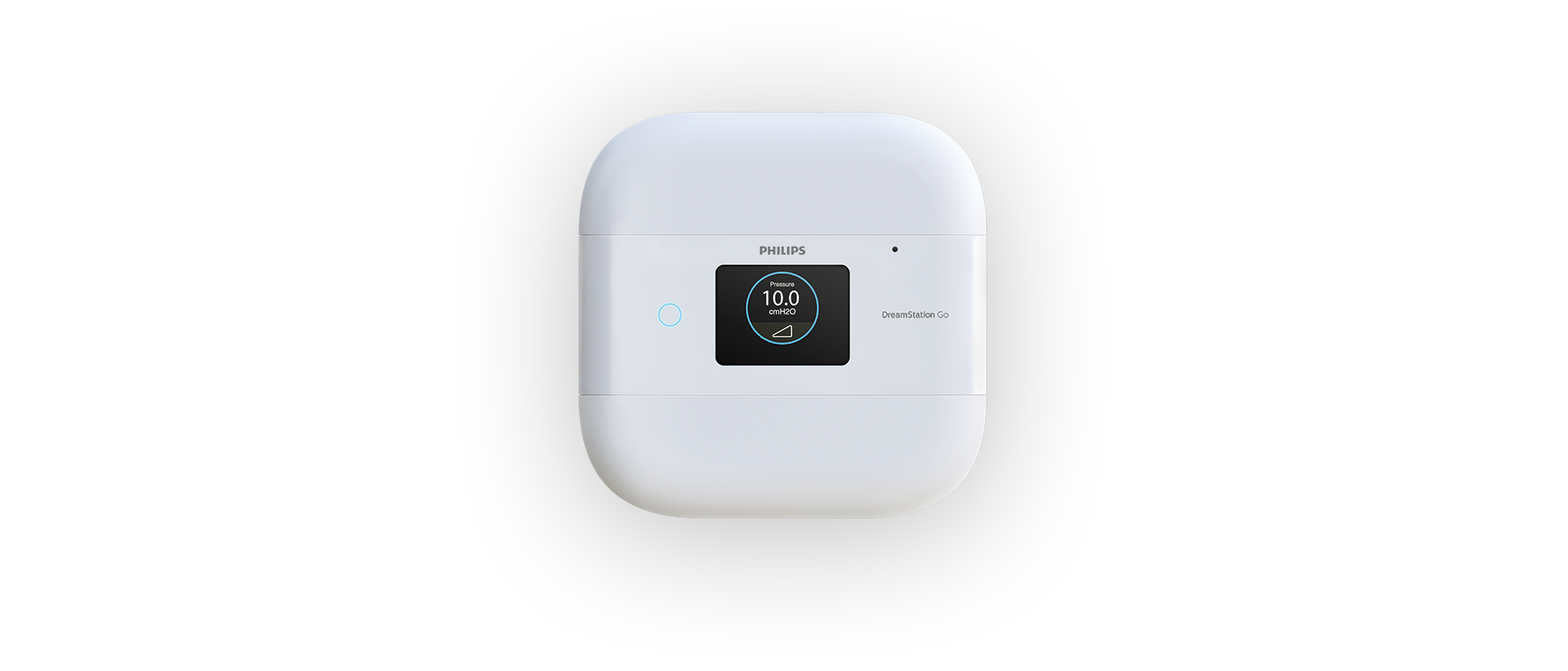
Touch Screen Only
Finally, I explored using only the touch screen for navigation. While this moved many of the touch points onto the already small screen, this would reduce mechanical processes on the device while keeping the interaction zones to a minimum. This also created more flexibility for future interaction needs.
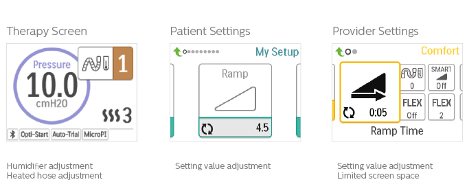
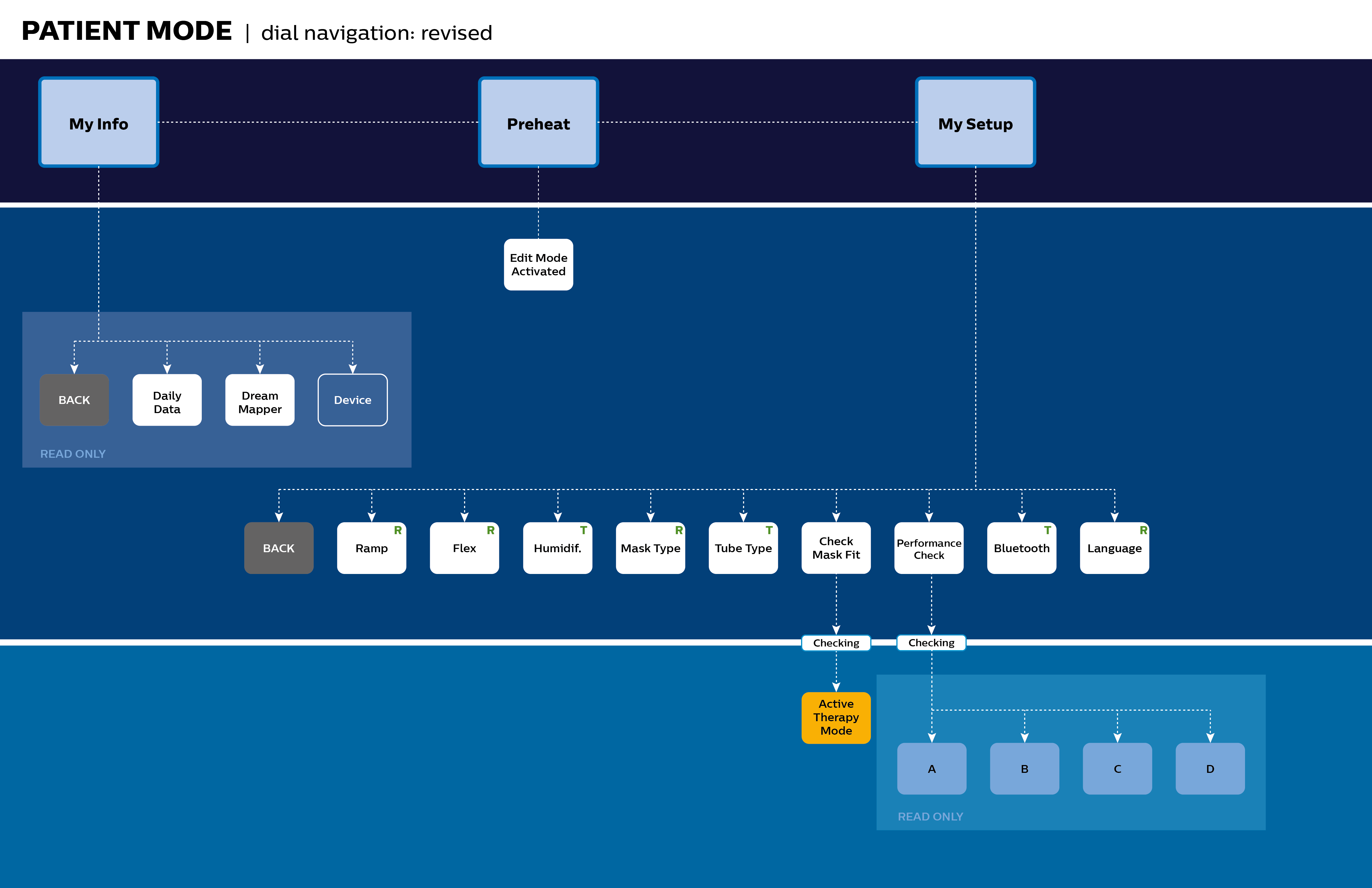
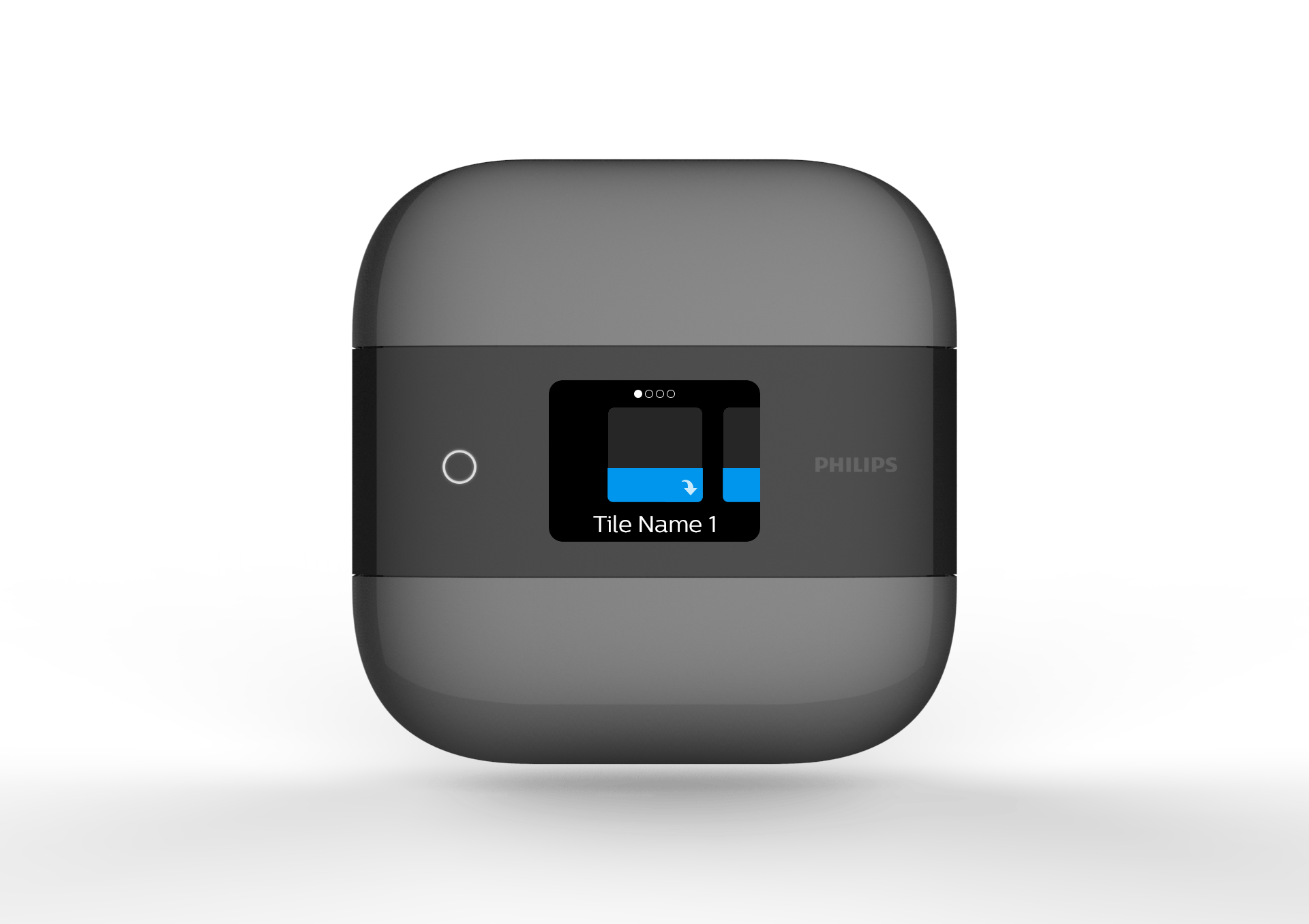
Laying Out the Information
After the decision was made on our physical navigation methods, we needed to lay out all the information and see if there were areas we could simplify. Much was learned from the DreamStation launch and we were able to use those learnings to offer suggestions on how to create a better flow of information. We created this and many other information architectures to bring to light areas of improvement.
Exploration of Therapy
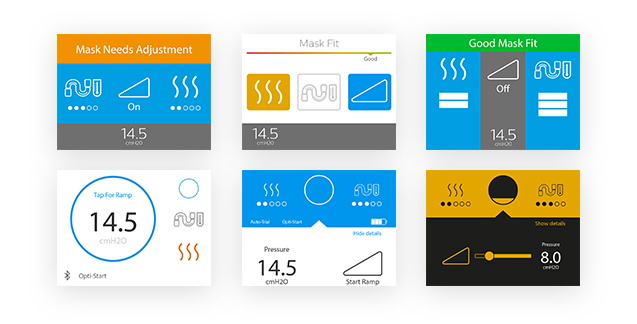
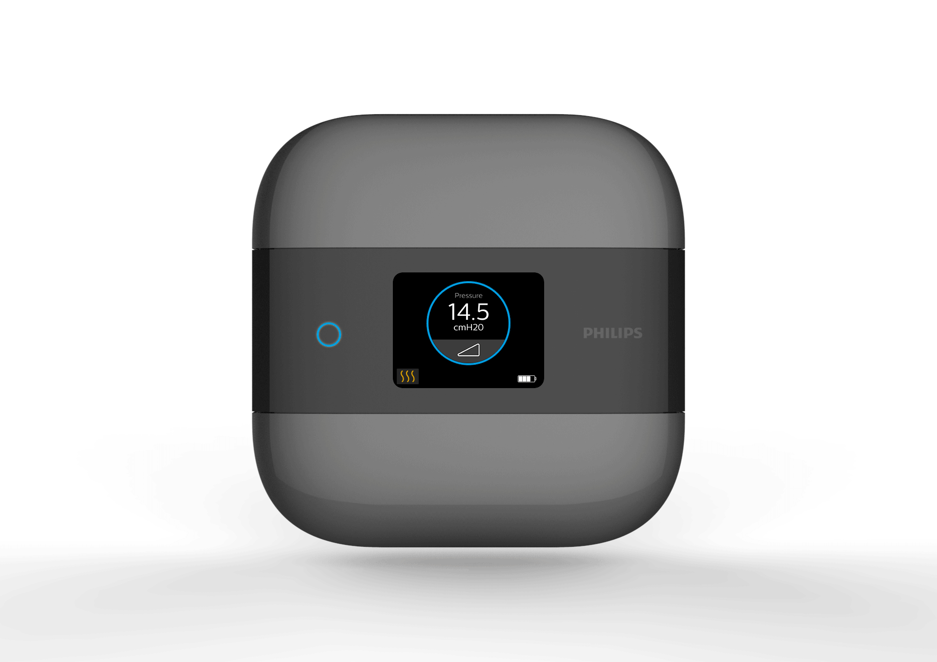
The therapy screen is arguably the most important screen in the patient experience. This screen and it's interactions are used every night. Because of this, we needed to focus on how we could create the best experience around it's use. Then we could formulate our interaction methods throughout the rest of the device to support the best use cases for the therapy screen.
The Decision to Go Dark
While we explored the many screens and interactions, we put a lot of thought into the use cases behind where and why this product is being used. One thing was true, the most crucial point of use was during the night before bed. With this in mind, we made the decision to do a color shift across the entire device and create a "Dark UI" which would remove the problem of shining bright white light into a possibly dark room. It also gave us a great platform for high contrast screens where we could utilize color in a more meaningful way.
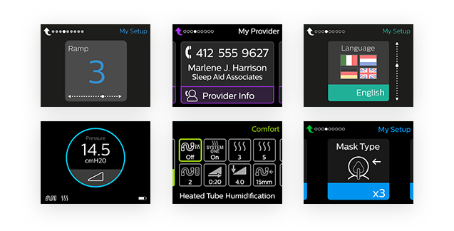
Creating Flexibility
Our decision to create a dark user interface was also influenced by the development of DreamStation ASV. DreamStation Go and DreamStation ASV were both going to have a dark bezel above the screen, this would allow us to blend our screen into the dark panel to make it feel seemless with the product. ASV was also going to utilize the DreamStation UI, this meant we would want to align our product look and feel, but ASV would still use the dial encoder input method. This means we'd have to find a way to create an enhanced experience that could be flexible enough to be usable on both devices.
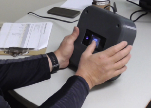
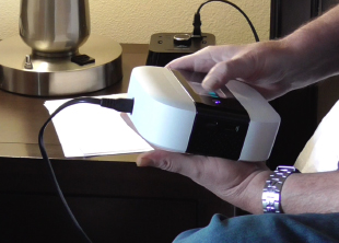
Testing The Direction
While creating the screens for the new user interface, I worked with the developer in charge of the UI to get it working on a device that we could use for testing. Since this device was going to be a first to market in terms of size and capability, our team 3D printed a box to house the prototype so we could test our new CPAP device without users knowing the size and form factor of the actual device to be released.
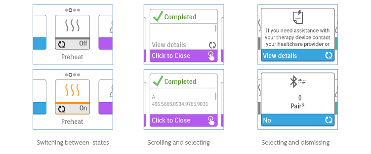
Tuning Touch and Microinteraction
After testing revealed changes we needed to make, though one thing was apparent, we could solve many of our issues with how we handled the interactions themselves. I dove into creating microinteractions around many of the commen interactions in the user interface. Below you can see two examples.
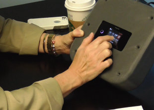
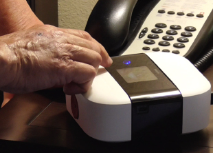
In Context Validation
I then worked with the developer to update the user interface and impement microinteractions. Another round of testing was scheduled, this time it would be in the context of a bedroom which was setup at a local hotel. We also removed the 3D printed shroud to see how users would handle such a small sleep therapy device.
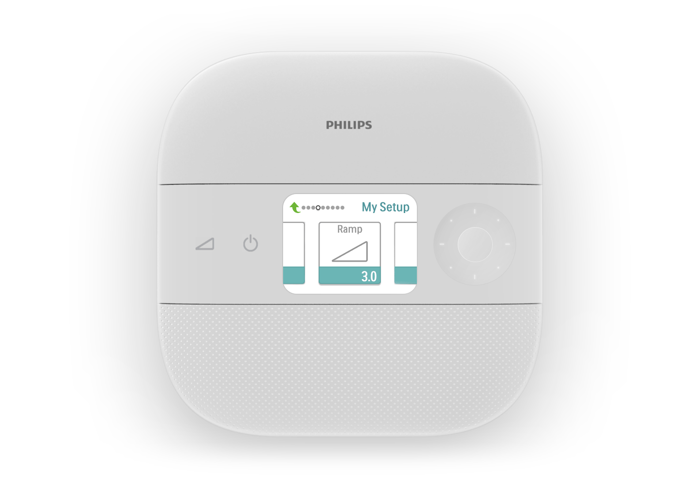
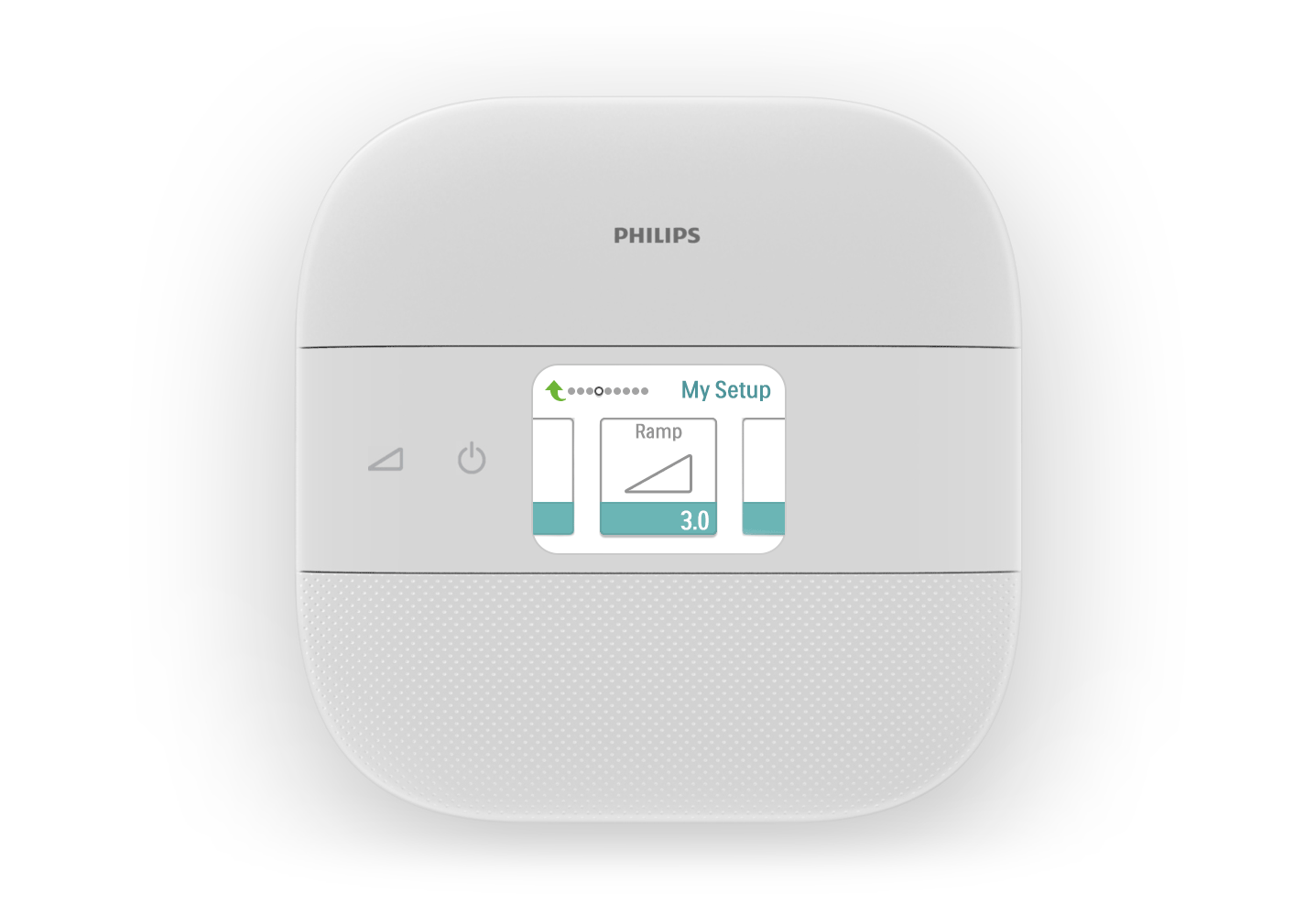
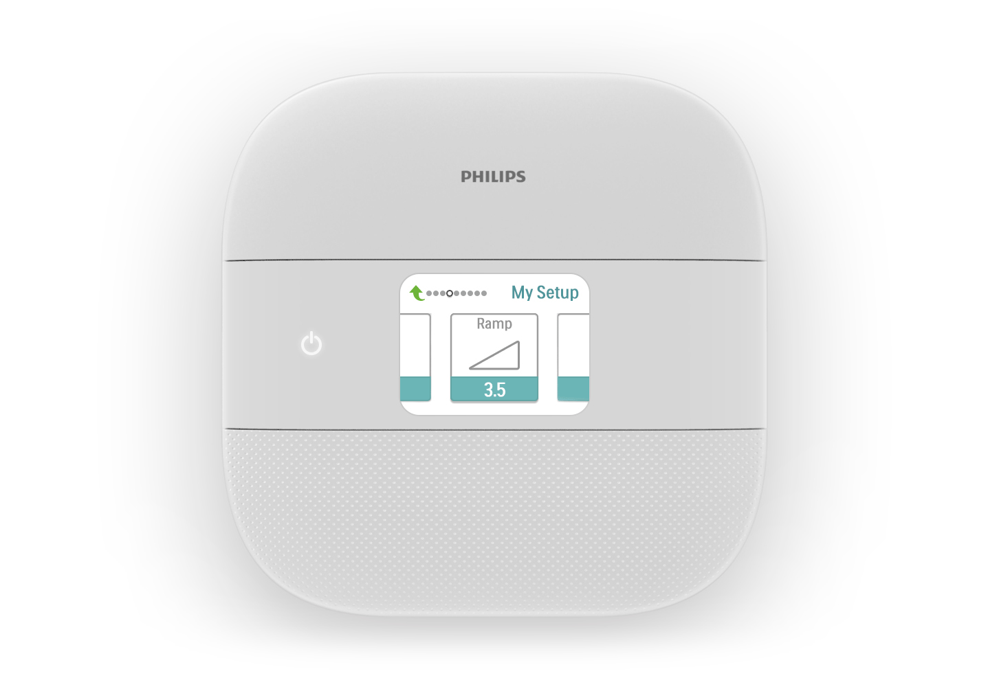
Blending Physical and Digital
Once we applied the changes that were discovered from the in context testing, effort went into fine tuning interactions and finalizing the look and feel of the interface. We also had some outlier portions of the UI that we could put effort into such as startup and shutdown sequences as shown below.
Project Outcome
We worked with the team to deliver and implement the final design intent. We launched the product on time to great review and received an IF Design Award in 2018 and the Good Design award.